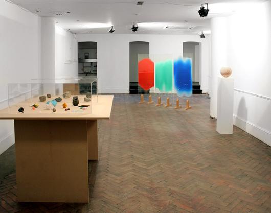
At London’s Frieze Art Fair

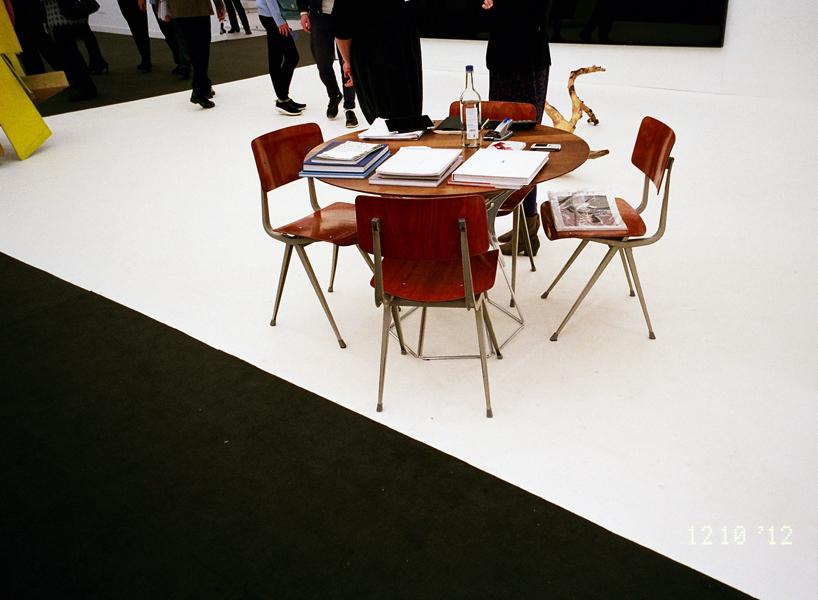
Which furniture designs do discerning art dealers truly prefer? Not to sell, but to sit in? That was the age-old question that photographer Sanna Helena Berger set out to answer while traversing the aisles of last month's Frieze Art Fair. Her utterly unscientific answer? Four out of five discerning art dealers prefer Friso Kramer, or failing that, some variation on mid-century bentwood. Quelle surprise. A Swedish photographer based in London, Berger chose to hone in on the subject after her maiden voyage to Frieze — tagging along with a friend's art class — proved otherwise underwhelming. “The space itself is divided into cubicles, very much like an overcrowded office, except that everything is crisp, bright, and white and within the cubicles the office wear is of a higher standard,” she explains. “Obviously I don’t claim that there was no worthwhile art there, because there certainly was, but the environment, the space, and the curation were not for me.” Instead of complaining, though, and jeopardizing her friend’s happy experience, Berger pulled out her camera and devoted the rest of the day to documenting art-booth furniture. Then she decided to share the results with usThen she decided to share the results with us, in a behind-the-scenes exposé that will no doubt put a lot of curious minds at ease, once and for all.
More

Caroline Achaintre on Arcademi

The biggest reason why we love our new Peer Review column: because it lets us heap mountains of credit onto blogs like Arcademi — the source of more of our "holy shit" moments than almost any other site — while giving us good reason to borrow their content. Namely, the opportunity to hear their subjects wax poetic about things like hairy tufting and multiple personalities, like today's subject, Caroline Achaintre. We were lucky enough to convince Arcademi editor Moritz Firchow to interview the London-based artist, who trained as a blacksmith before finding her way to a multidisciplinary practice inspired by the way German expressionism, post-war British sculpture, and Primitivism merge influences from both ancient and modern culture.
More

At the 2012 Łódź Design Festival

Over the past two years, there's been an explosion of design weeks popping up on this side of the pond, in smaller, more far-flung American metropolises like Portland, St. Louis, and Baltimore. But Europe's had a hold on this whole second-city-hosts-a-worldwide-design-event for years now. Take Lodz, the third-largest city in Poland, whose design festival is already six years strong. The Lodz Design Festival plays host to homegrown talents like Tomek Rygalik, as well as designers from abroad — both of which were a draw to our newest correspondent and dear friend Thorsten Van Elten, the London-based producer and retailer who reported on the event for us last week. But the real attraction, says Van Elten, was the city of Lodz itself. "At the beginning of this year I went to Transylvania, and I decided that I really need to travel to more places I've never been to. Poland was high on the list so when I saw a link on Facebook about the Łódź Design Festival, I checked for flights and hotel and managed to find two nights for just over £100. There really was no excuse not to go!"
More

Sam Orlando Miller, Le Marche, Italy

We talk a lot on this site about inspiration, and with most of our subjects that conversation assumes a certain measure of materiality — that we’ll be discussing the things they’ve amassed over the years or the places they return to over and over again on their travels. But for the British artist Sam Orlando Miller, it’s the lack of these things that gives him the energy and space to create. In 2000, after spending more than a decade in London building up his interiors firm, Miller and his wife, Helen, left it all behind for a quiet life in the Le Marche region of Italy, a mile from the nearest village, close to the coastline of the Adriatic Sea. But though they live in an admittedly enviable location, Miller says, “it didn’t need to be Italy. It just needed to be somewhere that was wilder than London, away from the culture I’d been immersed in. I found it difficult to think when surrounded by all that stuff. Here, you have to think about your own creativity and what your voice is. When you’re surrounded by nature, all of a sudden you’re on your own, psychologically.” And so rather than things, Miller collects thoughts and sketches and conversations, running over them again and again in his head until one bumps into the other and becomes a full-fledged idea. That’s what happened with his most recent body of work, The Sky Blue Series — a collection of mirrors and objects commissioned by the San Francisco gallery Hedge for a solo show, on view until this coming Monday, that marks Miller’s American debut.
More

At the London Design Festival, Part IV

Less than a week after we left the London Design Festival, it already feels like a distant memory — mostly because as of yesterday, we've already shifted our focus to making plans for the next edition of our own design showcase, the 2013 Noho Design District. And yet to some degree, we're also already drawing on what we saw at the LDF for inspiration: While we may not have access, in the middle of downtown Manhattan, to the kind of stunning 150,000-sqft. former mail-sorting facility that Designjunction had the luxury of spreading out in last week (incorporating multiple cafes and a pop-up version of the new online shop FAO, pictured above), we do have a few new talents on our hit list, a few schemes cooked up over drinks with old friends, and a few programming strategies to mull over. Meanwhile, we're offering you one last chance to see what we saw at the festival, which though it was by no means everything, will hopefully give you something to mull over, too.
More

At The London Design Festival, Part III

When you visit the show Image for a Title, curated by Study O Portable as part of the Brompton Design District, you can just about conjure the illusion that you’re in a world-class design-art gallery in some chic back alley of Paris, rather than a sunlight-starved basement at a hard-to-find address that happened to be printed incorrectly in this year’s Icon Design Trail guide. The show looks — and reads — so impressively that you start to believe what you want to believe rather than the reality, which is that many of the LDF’s visitors are likely to inadvertently miss out on seeing it, and that when it's over many of the pieces will, shrugs co-curator Bernadette Deddens, probably just wind up in storage. Welcome to the placebo effect, or at least our crude metaphorical approximation of it: the ability of humans to bestow a pill, an object, or in this case an exhibition with the qualities they expect or desire it to have. Deddens and her partner in crime, Tetsuo Mukai, invited a handful of designers to join them in exploring the possibilities of placebo thinking, producing an installation so well resolved that we’re going to go right on insisting it’s one of the top gallery shows on offer this week. Although, being more realists than dreamers, we’ve decided to help actualize our version of events by publicizing the show here on Sight Unseen. Check out each of its five projects below, and if you still have time to go see them before it closes at the end of the weekend, make sure to map your way to 8 Edgerton Gardens Mews.
More

At the London Design Festival, Part II

Just as everyone else is arriving in London, our time here is winding down — we have one last day today to take in the sights and sounds before flying home tomorrow, and we'll be spending most of it at one of the more newsworthy events of the week, Designjunction. There's going to be quite a few new releases happening at the Central London hub, but if you want to know the truth, we're most excited about seeing the building, a 250,000-sqft. industrial complex that should make a sublime backdrop for our humble photography efforts. Meanwhile, we've documented the last two days' worth of events and shows here, from a trip to the Mint gallery where we spied the marbled stools above to a plop onto the motley mix of benches arrayed around the V&A courtyard, all made by various design superstars. There's no way we'll make it to everything by tomorrow, but we've got a lot more to share, so keep coming back to visit us please!
More

At the London Design Festival, Part I

The first time we attended the London Design Festival, five years ago now, it became something of a benchmark for us — the design event against which we not only measured other design events, but would come to measure our own, the Noho Design District. That's because when you attend the LDF, you feel like you couldn't be anywhere else but in London; the spotlight is resolutely on emerging homegrown talents (thanks in part to the RCA) and there are always brand new projects and product launches to see (thanks in part to the fact that, unlike ICFF, the festival takes place halfway between Milan fairs). LDF has such a good reputation, in fact, that even the coalition behind New York City's official efforts to organize an as-yet-unnamed New York design week are looking to it for inspiration — can you imagine Tom Dixon giving away 500 free lamps in the middle of Times Square? It may happen sooner than you think. In the meantime, three years after our last trip to our favorite fair, we've returned, and we'll be making the rounds all week reporting on who and what we see here. After arriving on Friday morning, we had a bit of a slow start, poking around Shoreditch and hanging out with the incredibly gifted duo behind Silo Studio, whom we'll introduce in depth in the coming weeks. Check out the images here, and stay tuned for many more.
More

mono.kultur #32: Martino Gamper, All Channels Personal

It took me 16 issues (Miranda July) to discover the Berlin-based magazine mono.kultur, after seeing its pull-out poster on my friend's wall a few years back. "Dear life," it read, "do you want to hang out tonight? I should warn you that I will not be wearing any make-up and my hair is dirty. If you can handle that, call me. Yours, Miranda July." Five issues later (Tilda Swinton), I was obsessed: Here was a publication that, with each issue dedicated to a single long-form interview, was less about collecting personalities for front-cover bragging rights and more about truly, painstakingly, and intimately getting to know them. Which is all any of us dream about when it comes to our cultural idols, even those of us who, from time to time, have the honor of crossing their paths ourselves. So even though we've profiled Martino Gamper on Sight Unseen before — our lovely London contributor Claire Walsh having toured his home garden and secured us his favorite pasta recipe — we still jumped at the chance to excerpt mono.kultur's new sit-down with the Italian RCA grad, who talked to its editors about his latest public design projects, his feelings about Ikea, and the use of humor in his work. The interview runs to 10,000 words and — in print — comprises three booklets hand-assembled into one exhaustive artifact that stretches far beyond the small sample presented here. After reading it, scroll down to learn how to get your own copy before it — like most of the issues this cult favorite has produced — sells out forever.
More

A 20th Century Palate in The Gourmand Issue 00

In the summer before starting Sight Unseen, one of us had a very brief flirtation with the idea of attending culinary school. Along with design, food is our great love, so we were pleased this week — and maybe even a little bit jealous — to stumble upon a new magazine out of London that unites the two disciplines in the most fantastic of ways. Called The Gourmand, the first issue tackles subjects ranging from David Shrigley's new cookery-themed opera to Jeff Koons's recipe for apple dumplings. But our favorite feature — plucked from the site's website, which has a sprinkling of teasers for the print edition as well as practical food recommendations from artists, contributors and London's culinary cognescenti — has to be this collaboration between art director Jamie Brown and photographer Luke Kirwan, which depicts 20th century art and design movements in foodstuffs like American cheese and pink wafer cookies.
More

Study O Portable’s Neon Alphabet

Whereas most of us may never fully grasp the meaning behind the testicular descension metaphors and self-referential glyphs woven throughout Matthew Barney's Cremaster Cycle, the message behind his Drawing Restraint series — which has seen the artist challenge his creation process with obstacle courses and 270-pound dumbbells — couldn't be more relatable: creativity flourishes in any struggle with limitations. Many designers, for example, profess to do their best work under the pressure of client briefs; then there are those, like the London duo Bernadette Deddens and Tetsuo Mukai of Study O Portable, who in the absence of such briefs will invent their own rules to work around. Since they started their studio in 2009, the couple have been using the alphabet as a testing ground for aesthetic and material experiments, producing letter sets in various combinations of wood, leather, and plastic that must conform to strict, self-imposed standards of size and legibility. "It's really satisfying to work on the puzzle an ABC poses depending on one's materials and techniques," says Deddens. Their most recent is the Neon Alphabet, "a cross between signage, jewelry, and a font" that debuted at Design Miami/Basel this June with Belgian gallerist Caroline van Hoek.
More

Hilda Hellström, Swedish Sculptor and Designer

In any designer’s career, there are hundreds of split-second decisions that conspire to create the precise conditions under which good work can emerge. For the Swedish-born, London-based designer Hilda Hellström, it came down to this one: When she was asked to create a project for this year’s Royal College of Art exhibition at the Milan Furniture Fair, she says with a laugh, “the wood workshop was quite busy, but the resin workshop was nice and quiet.” Of course, there’s more to the recent grad's breakout Sedimentation vases than that; Hellström is obsessed with the idea of imbuing her objects with a myth and narrative of their own. But in many ways the vessels — which are made from layers of pigmented Jesmonite, a non-toxic acrylic-based plaster often used in ceilings and restoration work — are a reaction against something else. “My father was a carpenter, so I was used to working with wood, and I was bored of how you have to consider that it’s a living material,” she says. “Wood tells you what to make, but working with a moldable material like Jesmonite is almost like playing God.”
More