SU x PAOM for The Standard Shop

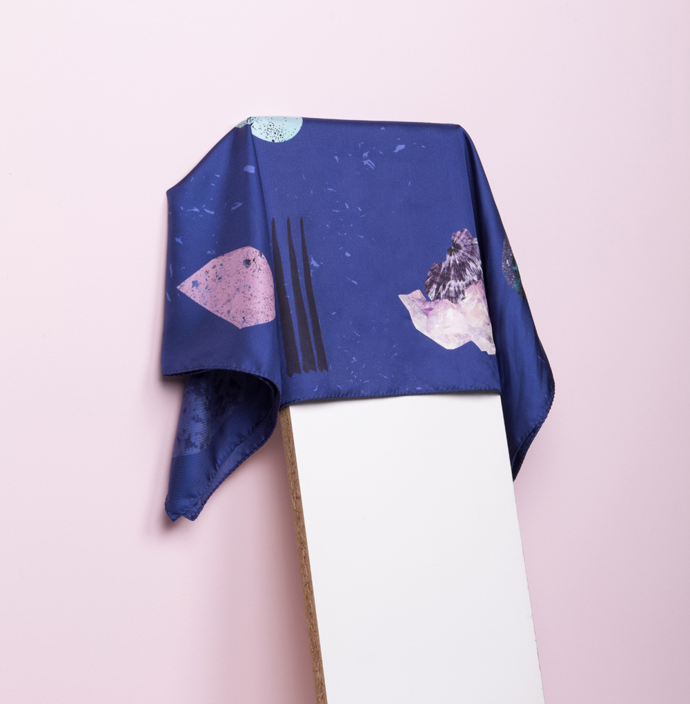
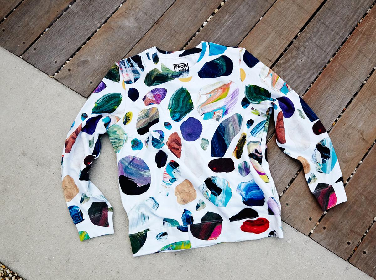
Last week in Miami, you could go home with art in just about any form — not just on a canvas (Art Basel) but in the form of a vase or a table (Design Miami), a pool toy (Grey Area x FriendsWithYou), a champagne bottle (Ruinart x Georgia Russel), or, if you happened by the shop at The Standard Spa, beach gear courtesy of yours truly. For this year's Miami fair, Sight Unseen teamed up with Print All Over Me to curate a line of warm-weather clothing and accessories sold exclusively at the Standard, featuring prints by Paul Wackers, Ellen Van Dusen of Dusen Dusen, Peter Judson, Rachel Domm, Caitlin Foster, Marta Veludo, Eunice Luk, Branden Collins, and Rafael de Cardenas (who designed the shop's interior a few years back).
More

Color Palette, From PIN–UP #17

When PIN–UP editor Felix Burrichter asked me to put together a product-driven color story for the magazine's new fall issue, which just came out last week, I said yes without hesitation — then secretly panicked later. It turns out that defining yourself by a single hue can be strangely intimidating. After thinking about it for ages, I resolved not to think at all, resorting to an idea that's been kicking around Sight Unseen's Pinterest feed for months now: electric blue, reimagined for the magazine as the more whimsical-sounding "peacock." I rounded up 14 of our favorite examples, which PIN–UP contributor Fausto Fantinuoli turned into the gorgeous illustration pictured above, along with the selections of Ambra Medda (dolphin), Tauba Auerbach (vermillion), and Paloma Powers (blush). Burrichter was kind enough to let us share the full story, which you can view after the jump.
More

Sight Unseen Turns Five!

Perhaps the greatest joy of our 5-year tenure has been the amazing and fruitful relationships we've formed with our peers — all of the people who create, love, photograph, and write about design every day right along with us. These people clearly feel the same about us, seeing as when we invited them to help us celebrate by making us a fifth birthday card, we were overwhelmed by not only the quantity of responses but also by the thoughtfulness that went into each piece.
More

2014, Part I

This week we announced the 2014 American Design Hot List, Sight Unseen's unapologetically subjective annual editorial award for the 25 names to know now in American design. We're devoting an entire week to interviews with this year's honorees — get to know the first five Hot List designers after the jump.
More

Thomas Albdorf and the Perfectly Uncomposed Still Life Photograph

Austrian photographer Thomas Albdorf shoots with a 35mm camera that results in a grittiness that is refreshing in this digital age, and his background as a designer is clearly evident in his calculated and well-balanced photographs. His still lifes — constructed from mundane objects or littered building materials — are full of texture, pattern, and intrigue.
More

Inka Järvinen, Graphic Designer and Printmaker

Finnish graphic artist and designer Inka Järvinen began her career with a degree in fashion from Helsinki University of Art and Design in 2005. But after graduating, she quickly discovered she preferred designing in two dimensions to three. So what do you do when you hold a diploma in something that doesn't suit your true passion? You follow those dreams back to school and get yourself a second degree! Armed with a BA in graphic design, Järvinen went on to co-found Tsto, a design agency whose hotshot clients include Artek, Levi's, and Nokia, and she continues to work on solo projects in her spare time. We especially love her graphic prints, controlled yet unpredictable. They're clean, and perfectly executed by someone that clearly understands the principles of balance, line, and pattern. We've excerpted some of our favorites after the jump.
More

Sigrid Calon, Visual Artist

For some reason, this is the week we finally put our money where our mouth is: First we took home one of Fort Standard's beautiful, mint-colored standing bowls, and then, on a whim last Wednesday, we picked up a risograph by Dutch visual artist Sigrid Calon, who we've had on our radar for quite some time. The hardest thing about buying Calon's work is narrowing down your options to just one — each print, which is based on the Tilburg artist's interpretation of an embroidery grid, is beautifully layered, using eight gradated colors, dots, and lines to achieve endless variations. Which one would you choose? See more after the jump.
More

Marine Duroselle, graphic designer

For the young, French graphic designer and Royal College of Arts grad Marine Duroselle, a relationship to pattern and shape is both instinctive and intuitive, owing in large part to the vast array of objects she was exposed to as a child. Growing up in Peru, her mother an anthropologist specializing in pre-Colombian textiles, Duroselle was continually surrounded by rich fabrics, threads and other types of South American crafts; a period of post-adolescence spent living in New York, on an exchange program at the School of Visual Arts, only further emphasized her interest in textiles and color.
More

Suzanne Antonelli, Print Designer

On her Tumblr, Suzanne Antonelli self-identifies as a printed textile designer. But in truth, the Norwich, UK–based designer's graphics have taken on such a life of their own that Antonelli has begun to be more widely known for the patterns themselves. In her webshop, those patterns are applied to vegetable ink–printed recycled paper notebooks, or, more simply, to giclee A1 posters — the better for adorning the walls of your house, which you're going to want to do in spades after perusing these images. Of her interest in print-making — and particularly of the repetitive geometries that have become her signature — Antonelli has said: "I first became interested in pattern when I was doing my foundation in Brighton. There was hardly any room in the studio and desks were on a first come first serve basis; I think that the lack of space made me focus more and I produced a lot of really small detailed work on graph paper using tiny dots to make up different blocks of pattern."
More

Kate Miss

The fact that Los Angeles designer Kate Miss has, since we shot her Koreatown workspace last fall, chopped off her hair, adopted a dog, and moved studios not once but twice — the second time abandoning her freelance graphic design life altogether for a full-time position at Karen Kimmel — may tell you just how busy we’ve been around these parts. But it could just as easily be a reflection of how much Miss craves change. She’s the only person we’ve ever heard utter the words: “I love moving.” And yet that peculiarly peripatetic quality is what defines Miss — it’s what brought her from Seattle to New York and finally to LA, and why she’s equal parts known as a blogger, a photographer, a jewelry maker, and a graphic designer.
More

Kristina Krogh, Artist and Graphic Designer

Kristina Krogh studied graphic design before setting up her own studio in Copenhagen in 2012, where she spends part of her time on freelance design projects and the rest on her extensive line of limited-edition art prints, notebooks, and notecards, pictured in this post. Her layered geometric compositions feature a mix of contrasting and complementary surface textures taken from everyday materials like marble, ply, wood, cork, and paper. "My inspiration comes from the things that surround me: a beautiful old parquet, a perfect color combination on a building, a stone floor in a church, a bike ride through Copenhagen," she says.
More

Supreme Bon Ton’s Meteorite Collection

Suprême Bon Ton is a Paris-based textile design studio helmed by Ella Perdereau, who founded it last year after traveling around India and Latin America for creative inspiration. Her first collection, Meteorite, is a series of scarves that incorporate patterns and textures from rocks and minerals. Perdereau worked with traditional textile printers in Lyon to produce the scarves, then turned to the up-and-coming photographer Florent Tanet — known for playful pastel still-lives that have been featured in the New Yorker and Wired — to photograph them. Tanet also shot Perdereau's collection of painted rocks and other reference objects, which are featured in the second half of the post.
More