The Spectrum Issue of Gather Journal

Since its launch in 2012, each issue of the biannual food journal Gather has been organized around a theme, but this summer's is by far our favorite. We're excerpting a story from “Spectrum,” an entire issue devoted to color.
More

Week of July 27, 2015

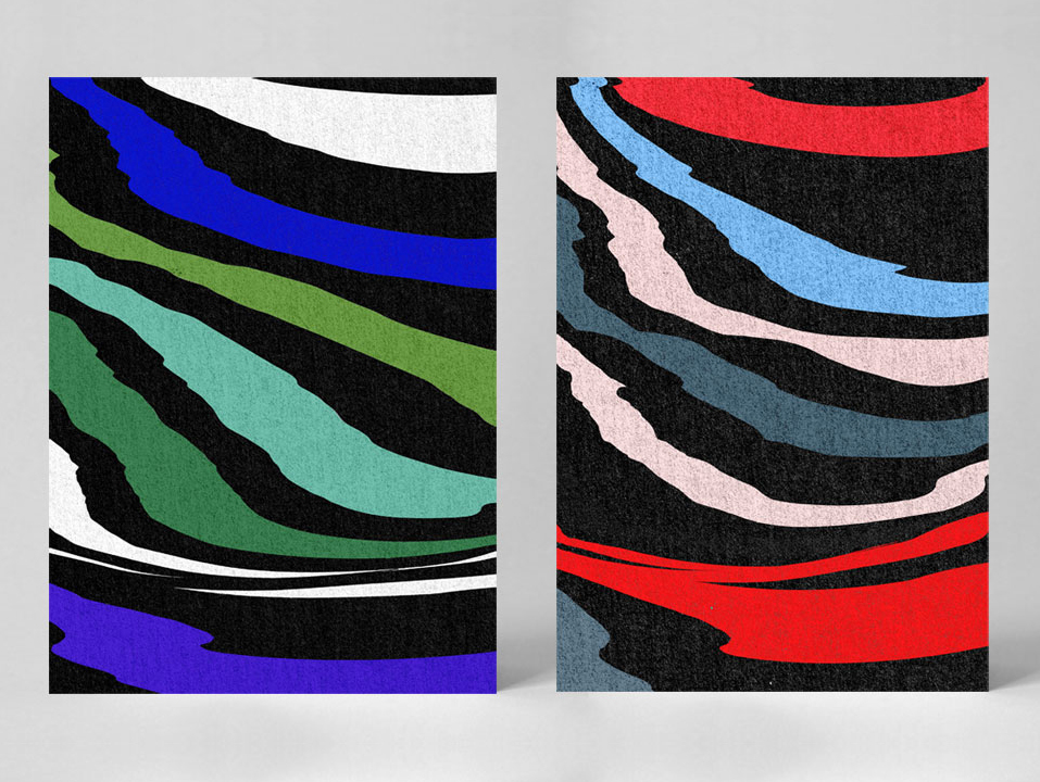
A weekly Saturday recap to share with you our favorite links, discoveries, exhibitions, and more from the past seven days. This week: A gorgeous crystal-growing video made us ponder the meaning of life, brushtrokes and Matisse-style cutouts on tote bags and kimonos were our favorite visual trends, and a French graphic design duo (pictured above) caught our eye with their technicolor zebra patterns.
More

Lottie Hughes, Artist

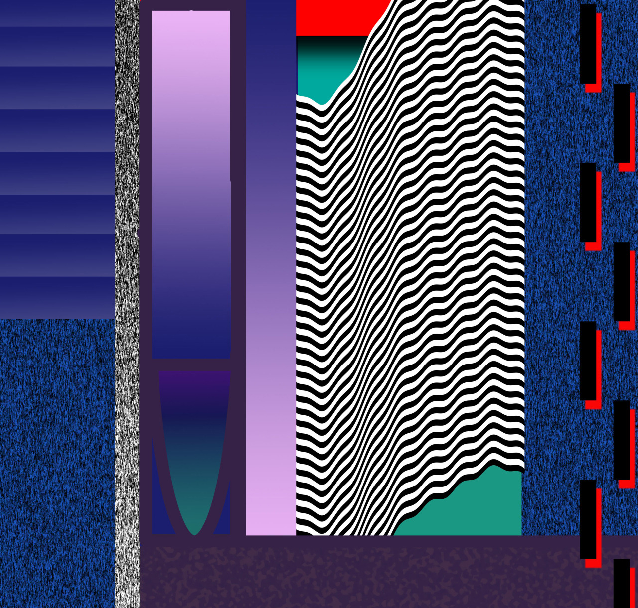
London-based Lottie Hughes graduated with a Bachelor's degree in fine art only two years ago but she’s already on our radar, thanks to an exceedingly well-kept Tumblr. “My designs were initially a way for me to come up with compositions for my paintings but the more I learned, and the more confident I became with Photoshop, these have now become the main body of my work,” says the 24-year-old designer. Hughes primarily takes inspiration from artists like Camille Walala, Atelier Bingo, Trudy Benson, and Klaus Merkel, as well as from everyday life in London. "My designs are abstract versions of what I see on a day-to-day basis — colors clashing, angles of buildings interlocking, movement and light."
More

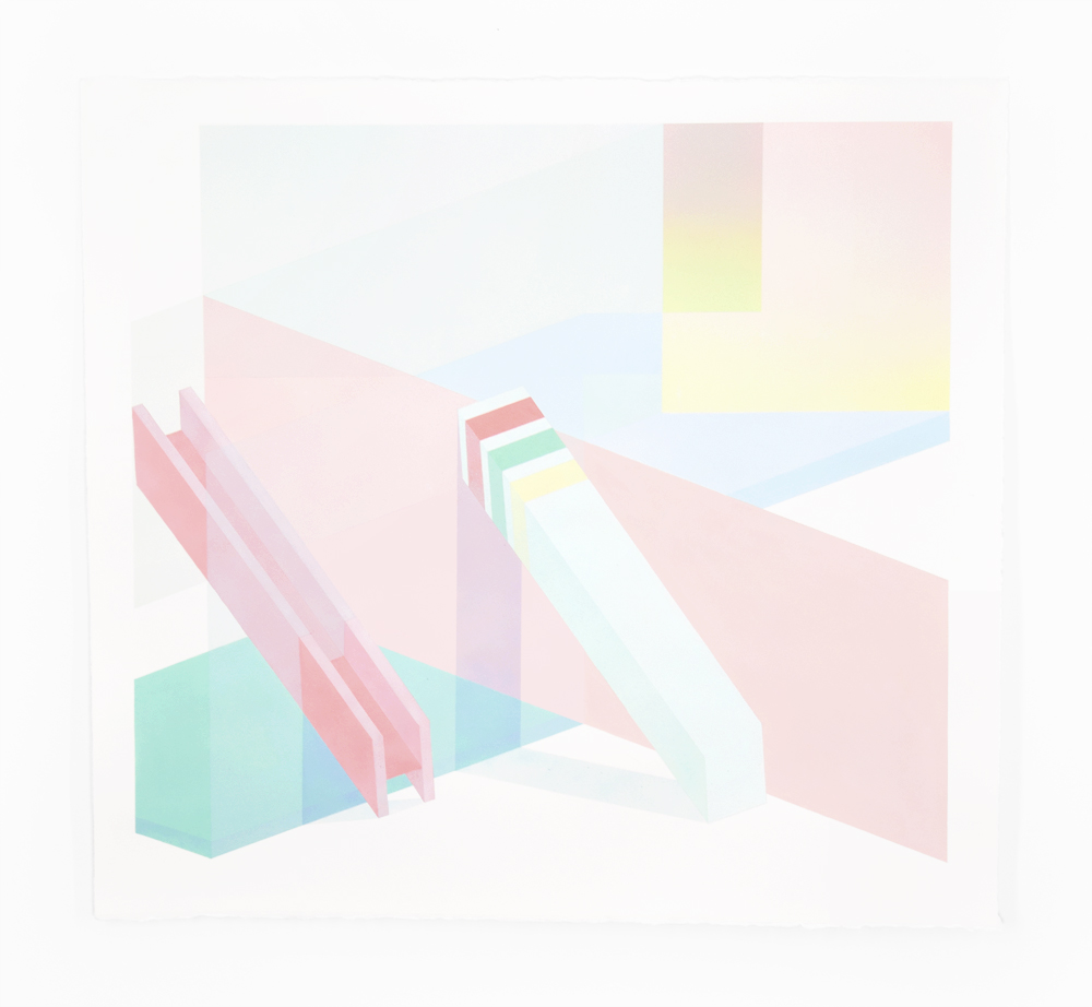
Subtle, Pastel Paintings Inspired by the Tokyo Metro

Growing up in Wisconsin, artist Trek Matthews was initially inspired by his natural surroundings, incorporating wildlife scenes and Native American mythologies into his illustrations. But following a move to Atlanta and a short stint in Japan in 2014, his artistic style began maturing into what we see today.
More

Week of June 1, 2015

A weekly Saturday recap to share with you our favorite links, discoveries, exhibitions, and more from the past seven days. This week: one of our favorite ICFF stragglers, two exhibitions inspired by kids' playgrounds, and three Sight Unseen OFFSITE alumni who have somehow developed entirely new bodies of work since mid-May.
More

Lauren Clay, Artist

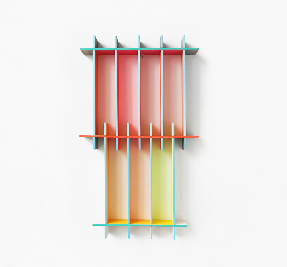
Artist Lauren Clay has a background in painting and printmaking, but her work is hardly confined to the two-dimensional plane. Her body of work began as a series of large paintings on paper. But as she progressed, she became more and more interested in the inherent tendencies of paper to curl away from the wall, and she began to explore the third dimension, bridging the gap between painting and sculpture. We can see this in her delicate cut-out grids on marbled acrylic paper, which naturally curl away from the wall, creating a presence in the viewer's space and a dialogue between paper and wall, paper and viewer, and 2D vs. 3D.
More

Week of March 23, 2015

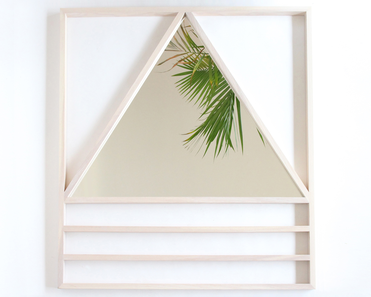
A weekly Saturday recap to share with you our favorite links, discoveries, exhibitions, and more from the past seven days. This week: two amazing but different geometric mirrors (including this beach house–ready one by Alex Drew & No One), a digitally rendered interior that has us ready to move in, and vintage napkin rings that look like cool-girl jewelry — by none other than Nathalie du Pasquier.
More

Jacqueline Klassen, Ceramicist

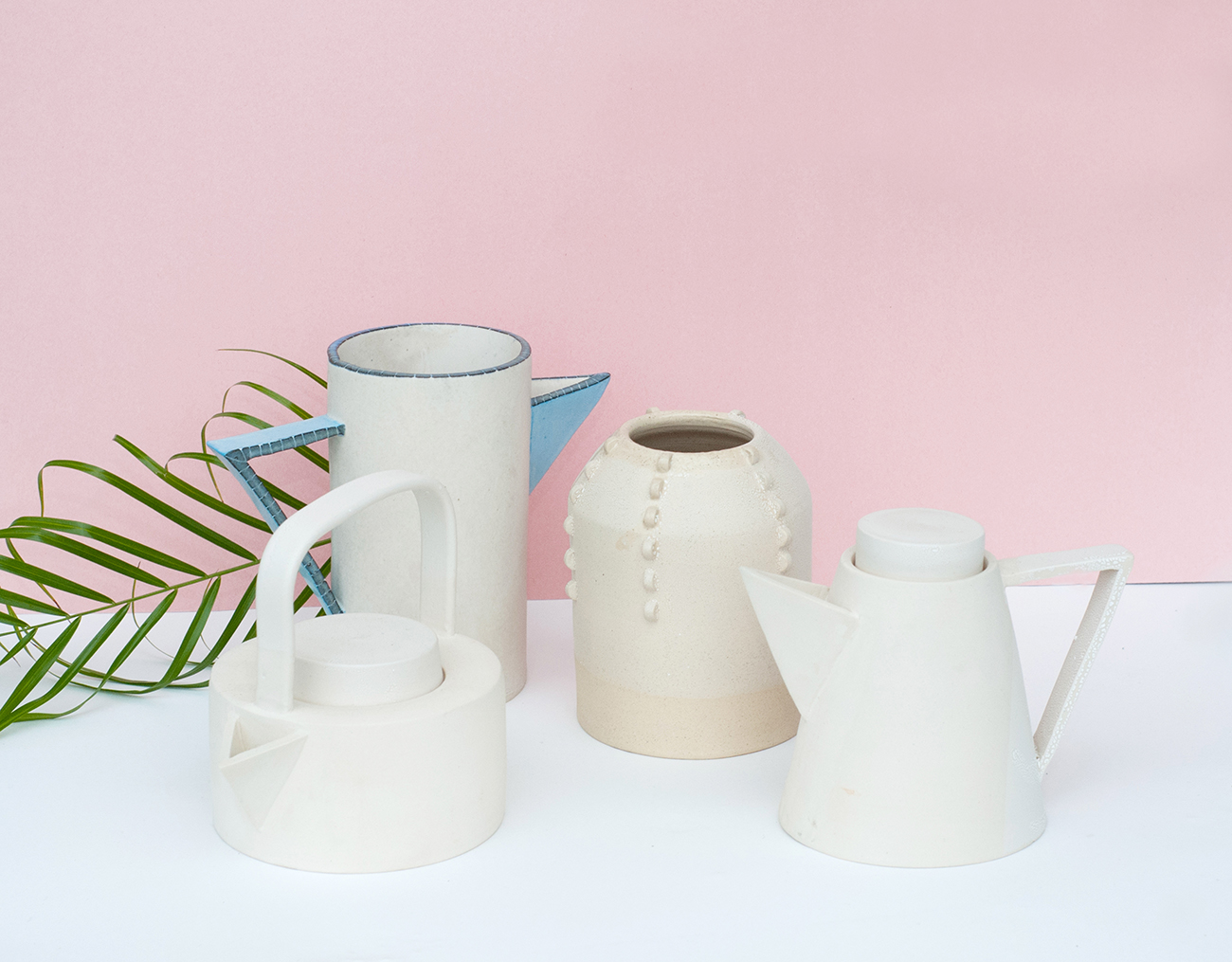
Jacqueline Klassen didn’t grow up around design; her father was a therapist and her mom a case management worker, and their family’s greatest joy was good food. She didn’t study it either; she holds an undergraduate degree in English literature and was often told, “Go to school! You’d be a great teacher!” But rather than teach, Klassen instead signed up for more classes herself — only this time it was a six-week course in ceramics. “I immediately was in love,” Klassen remembers. “I was always grasping for something that would be a good fit for me; I was trying to make something work, but I hadn’t yet found it.” Over the next year, she toyed with the idea of going to grad school for art history. But when she found herself in the studio, at the wheel more often than not, it became apparent that perhaps she should listen to her gut.
More

Jesse Moretti Editions for Little Paper Planes

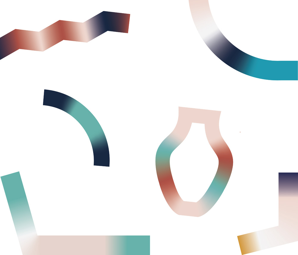
We've been huge fans of Cranbrook grad Jesse Moretti's work ever since her solo show at Patrick Parrish gallery (then Mondo Cane), way back in 2013. There's something about the palette Moretti uses, the saturated gradients she employs, and the way she zigzags back and forth between spare, geometric marks and full-bleed patterns that is absolutely perfect to us. The only problem with the pieces she made for Parrish was their ever-so-slightly out-of-reach price tag. So it was with great excitement that we stumbled upon Moretti's latest edition — a series of seven small works on paper (either 8.5 x 11" or 17 x 22") for the San Francisco–based shop and publishing house Little Paper Planes, ranging in price from $35 to $130. (Yes, we already put in our order!) We're posting images from that collection here today and also excerpting a brief interview Moretti did with LPP. Read all about here, then hop on over to the shop to make these beauties yours!
More

Barbara Kasten at the ICA Philadelphia

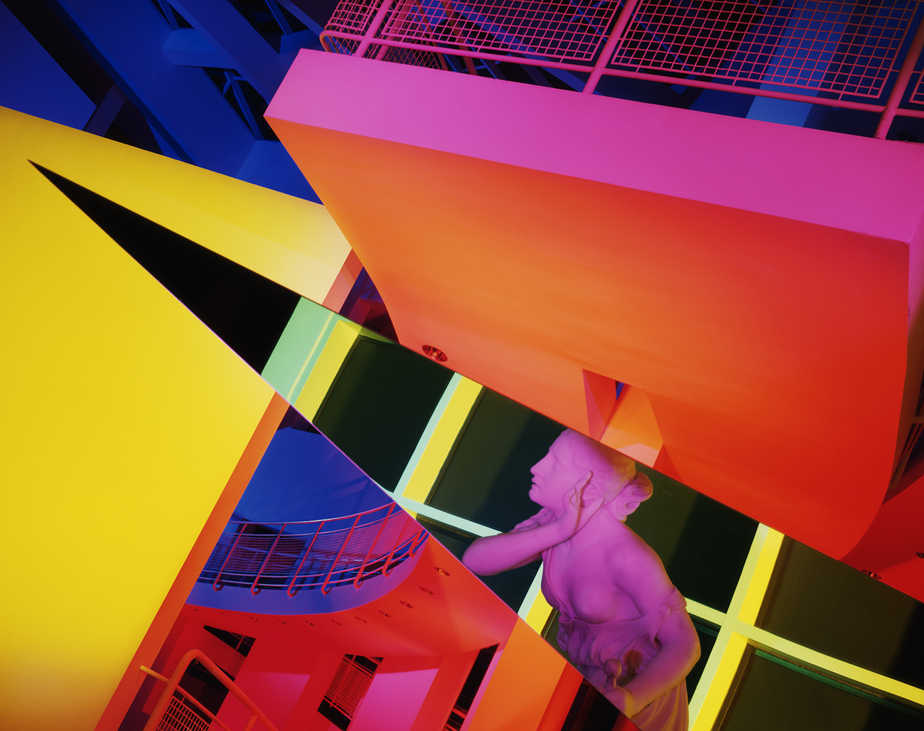
If Barbara Kasten’s colorful, angular compositions look as though they could have been arranged just last week by some prop stylist in Los Angeles — well, consider that a testament to Kasten’s massive, if massively underappreciated, influence. The Chicago-based artist and photographer is currently the subject of a long overdue solo exhibition at Philadelphia’s Institute of Contemporary Art; Stages spans five decades of work, from fiber sculptures to cyanotype prints to set design to a brand-new, site-specific installation that plays beautifully with the ICA’s interior architecture.
More

Week of February 9, 2015

A weekly Saturday recap to share with you our favorite links, discoveries, exhibitions, and more from the past seven days. This week, the humble accent table takes on many forms: an iridescent I-beam, a rug-wrapped hexagon, and a charred-wood square with a hairy interior void.
More

Week of January 26, 2015

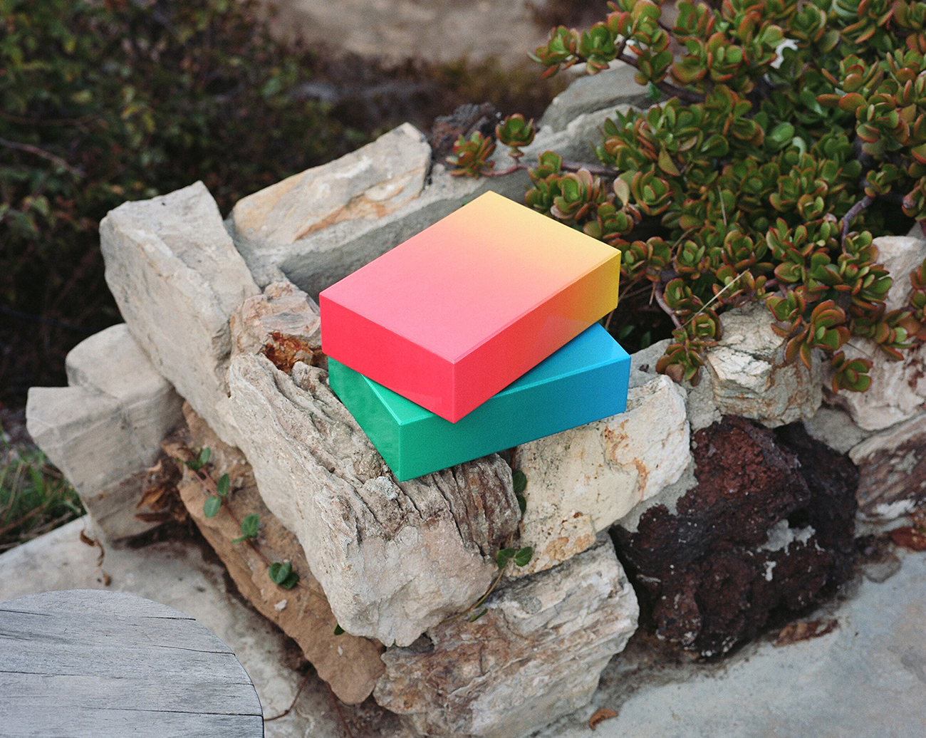
A weekly Saturday recap to share with you our favorite links, discoveries, exhibitions, and more from the past seven days. This week: Sorting the best of the rest from January's design fairs, getting a crash course in great product photography, and hailing the almighty power of pink (not to mention colored gradients, as seen in Bryce Wilner's puzzle — yes that's a puzzle — above).
More