01.28.17
Saturday Selects
Week of January 23, 2017
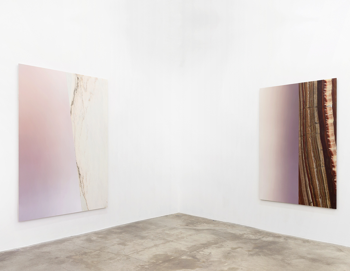
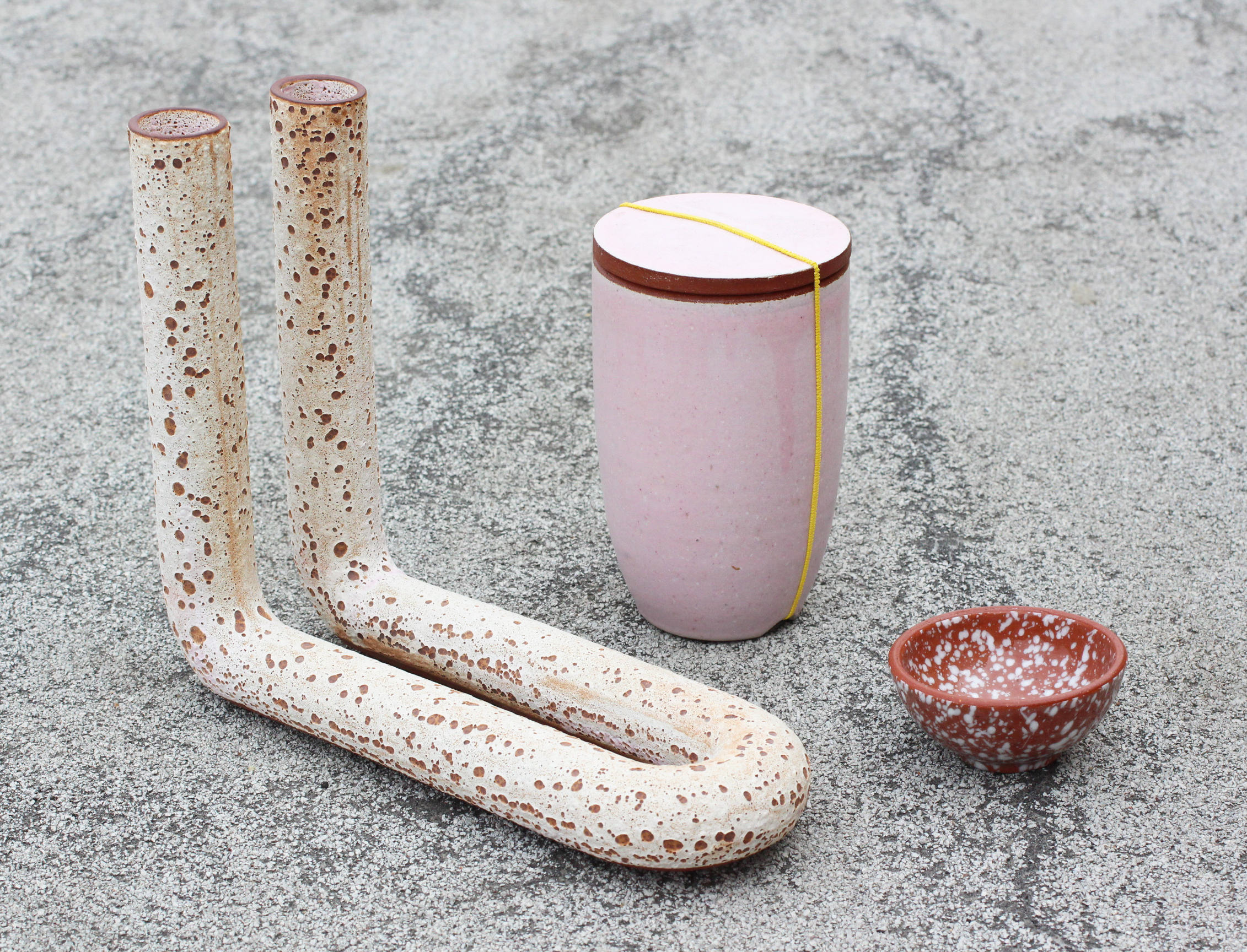
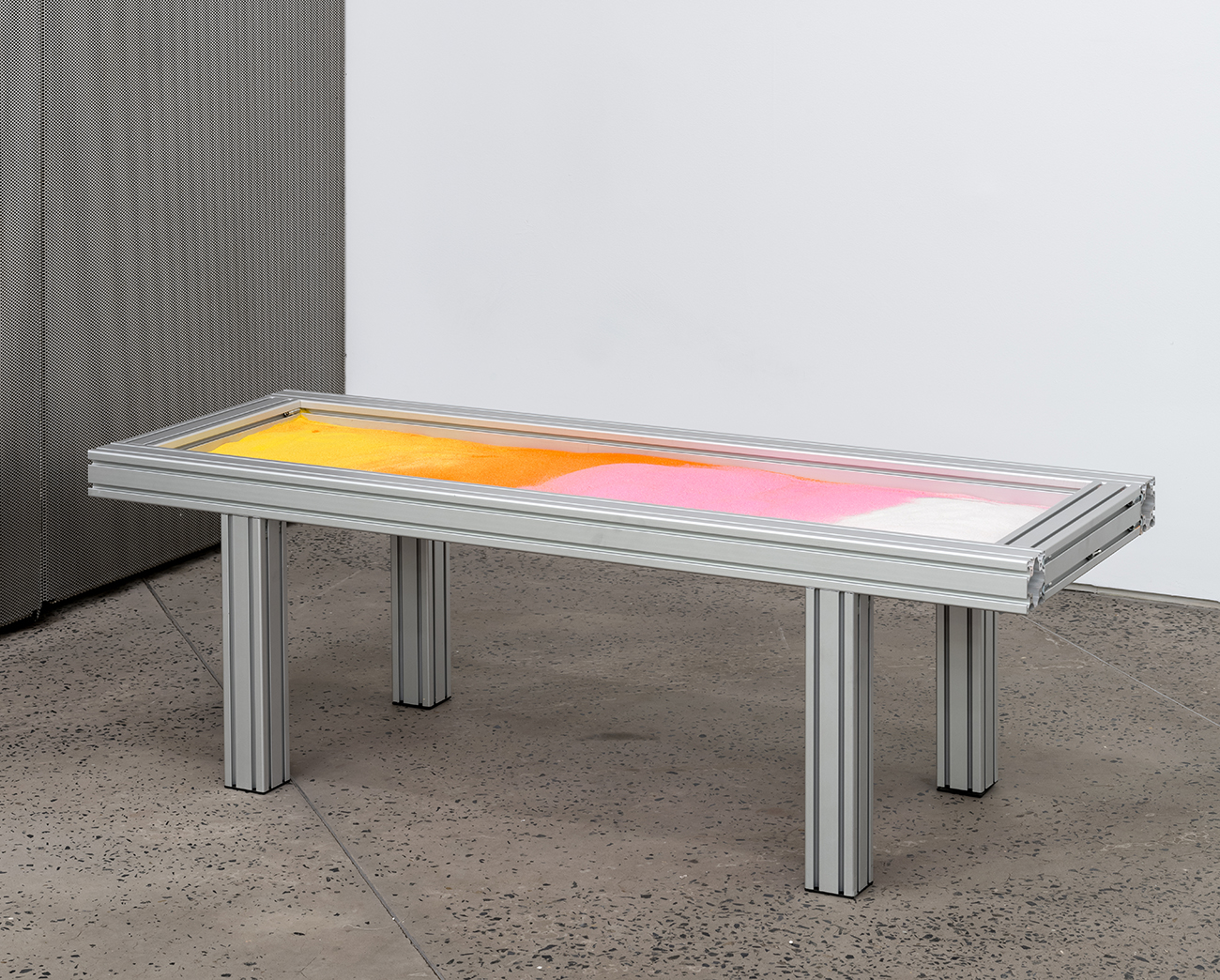
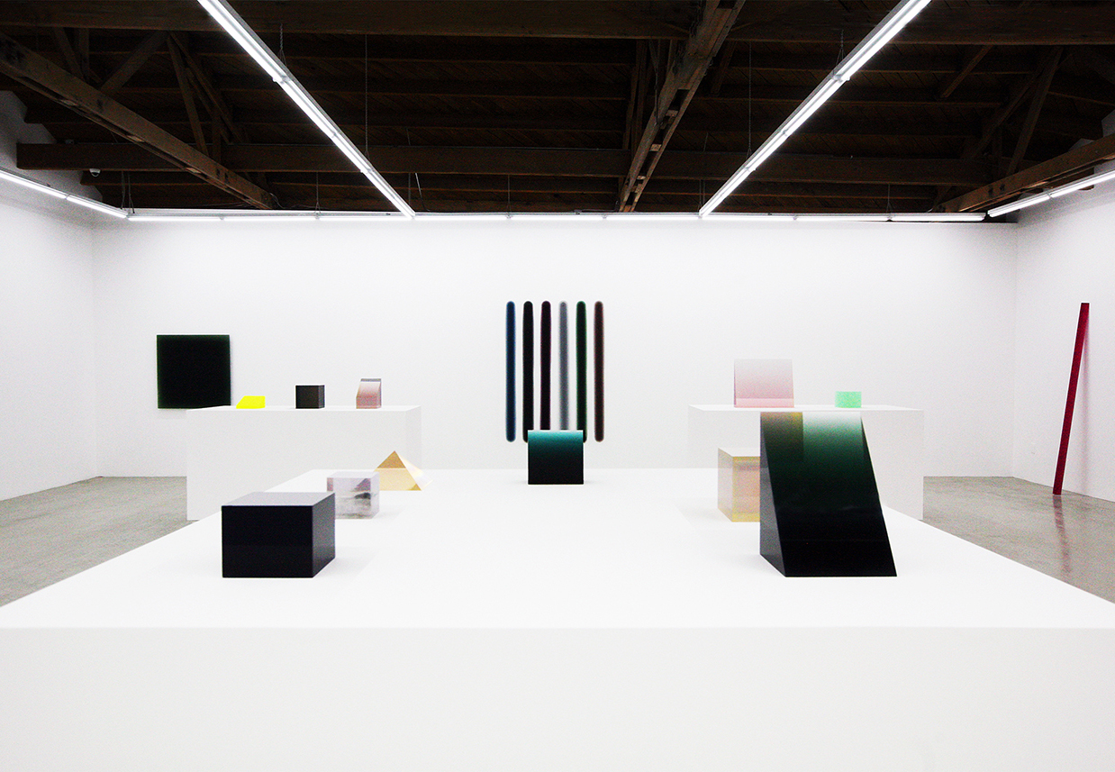
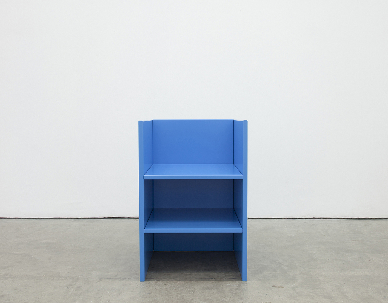
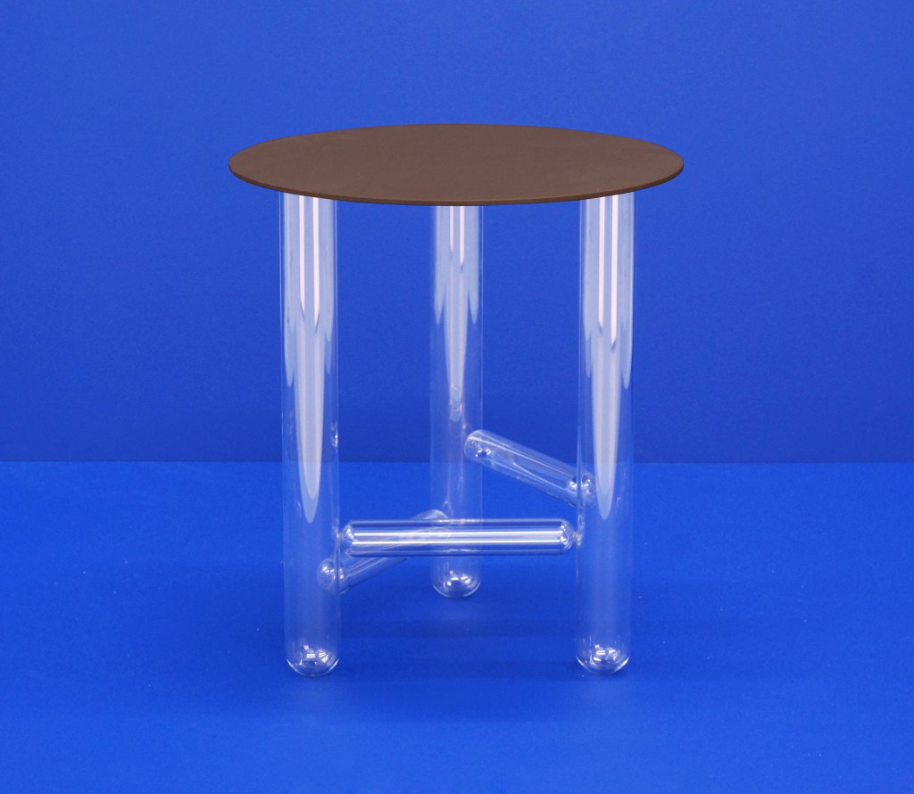
A weekly Saturday recap to share with you our favorite links, discoveries, exhibitions, and more from the past seven days. This week: new good things like a pastel-colored jewelry store and an insanely affordable geometric rug, plus a few old good things like a marbled chair, a terrazzo table, and the glass-legged beauty pictured above.