When it comes to its namesake subject matter, Spaces magazine doesn’t discriminate: There are live-work lofts in the wilds of Brooklyn, warehouses in Australia turned into artist communes, cafes in Hamburg lined with vintage shoe lasts and gumball machines, and even a section of so-called wall spaces, where entire spreads are devoted to close-ups of textile, teacup, or taxidermy collections. “We wanted an eclectic mix, somewhere between vintage, designy, and handmade,” says Louise Bannister, managing editor of the cult indie lifestyle magazineFrankie, who co-produced Spaces as one of the magazine’s twice-annual special projects. While past editions have included a recipe book or a small photo album filled with 110 snapshots culled from contributors around the world, the editors chose to focus on interiors after the success of Frankie’s only section devoted to them: Homebodies, where they feature casual portraits of the homes of musicians.
For Spaces, the team scoured the internet from their homebase in Australia looking for creatives of all stripes, pairing large-format images with personal interviews with the subjects about how they found their space and what they keep in it. “We wanted Spaces to feel inclusive, whereas a lot of interior mags are quite exclusive,” says Bannister. “We really wanted people to be able to relate to it.” Check out excerpts from the magazine in this slideshow, which have been adapted slightly to fit Sight Unseen’s format, then head over to Frankie’s website to get your very own copy.
Maria-Klara Gonzalez, Barcelona. Text by Jo Walker, photos by Wai Lin Tse. Maria-Klara’s Barcelona flat was a “sleeping beauty” when she and her boyfriend Roger first happened upon it three years ago while biking to his parents’ house for dinner. “It had a kind of dreamlike atmosphere with different wallpapers in all the rooms,” the illustrator and former architect remembers. “It had been empty for years and unfortunately the last inhabitant had been a heavy smoker and the flat was extremely stuffy. So it was a hard decision, but when we tore out all the wallpaper and painted the whole flat, the air changed completely.”
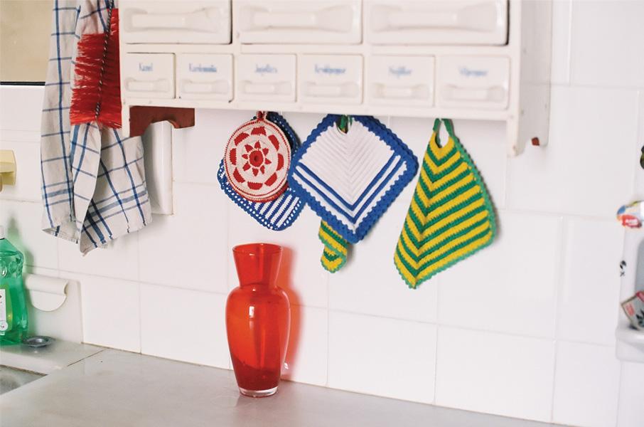
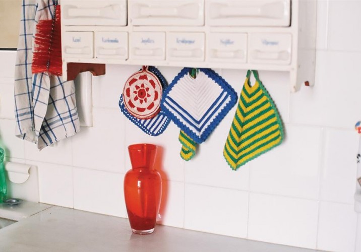
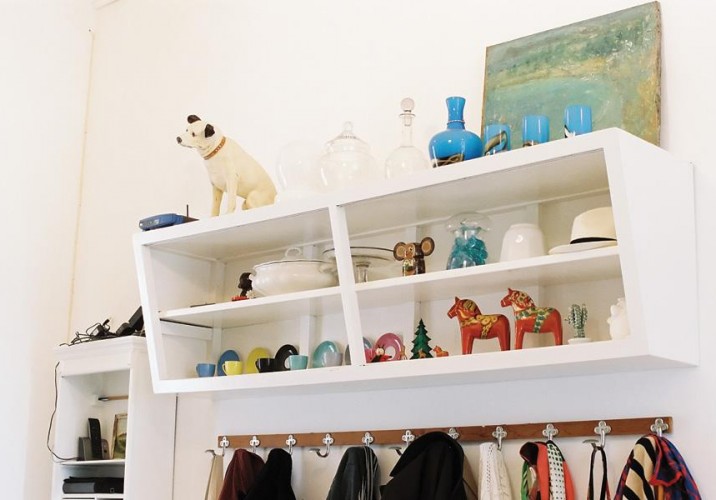
Maria-Klara Gonzalez: The couple both have studios at the front of the apartment — she for her illustration business, he for his theater company. The house is “quite eclectic,” Maria-Klara explains. “I studied architecture in the heydey of minimalism, but at the same time I love color, little things, and textiles. I wanted the flat to be white so it could serve as a canvas for all kinds of delightful nonsense. I owe a lot to a tradition of style in my family, starting with my great-grandfather and also the fact that I grew up in Sweden. There has always been a love for beautiful things and textiles paired with lots of imagination and do-it-yourself spirit surrounding me.”
Maria-Klara Gonzalez: “This home is growing organically,” she says. “There is quite a lot of coincidence, and lots of love of course, behind it. One friend gave us some of the furniture, some we found in the street, and most we bought at the Els Encants flea market. It’s kind of a love story told by objects.” The floor tiles are original, and typical for Barcelona. “Almost every room has a different pattern.”
Maria-Klara Gonzalez: Sadly, Maria-Klara and Roger’s little love story of an apartment might soon be under threat. There are plans to build “a hideous five-star hotel” out back. “Somehow mentally we’re already saying goodbye to this home,” says Maria-Klara. But until then life, and love and creativity, continue.
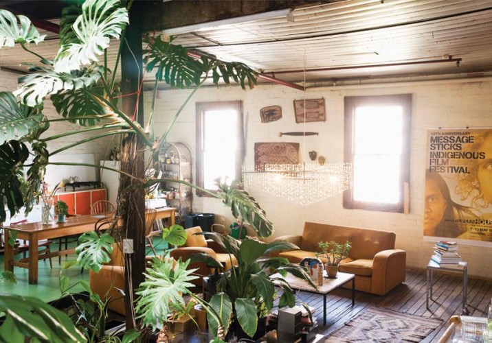
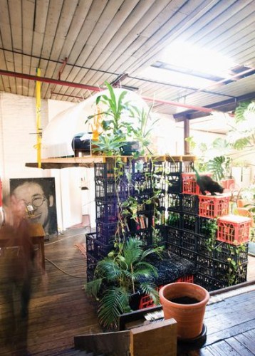
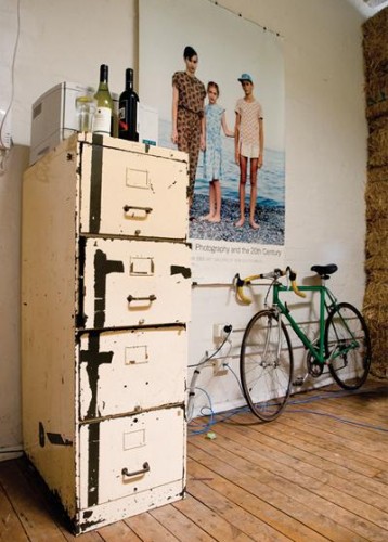
Mathieu Gallois, Redfern, Australia. Text by Louise Bannister, photos by Carine Thevenau. Having made the move to Sydney from Canberra after studying art, Mat found a like-minded group of people looking to share their warehouse space in Redfern. It was run down and lacking light, so Mat told his perspective housemates that if they chose him, he’d renovate. It sealed the deal. Over the years since, the warehouse has seen many faces and interior changes. Mat, his housemates, and a variety of guests have created an idyllic space which aims to support the burgeoning arts scene. “We created a ‘tree house’ where people can come and stay short term and an affordable loft space where people can stay long term,” he says. “Because Sydney can be so expensive, we want to help art students who are just starting out in their careers.”
Mathieu Gallois: As an artist, architect, and furniture designer, Mat is interested in living in an experimental environment where he can push the idea of being green. The tree house dome, for instance, is from a previous architectural job, the logs from nearby Centennial Park, and the crates from a “street entrepreneur” — a fancy name for a guy they paid to source stuff that had been chucked out around the neighborhood.
Mathieu Gallois: The furniture, which smatters the place, is recycled too. Like a lot of conscientious people, they’ve signed up to receive 100 percent green energy, but more oddly, they sometimes use their bathwater to wash their clothes.
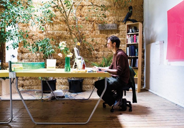
Mathieu Gallois: “The ping-pong table is usually a desk and sometimes a ping-pong table,” says Mat, pictured. The wall is made from straw. “When people come here, they do not feel intimidated, or poor or alienated by rooms full of very expensive designer goods. They don’t have to marvel at a view they will never be able to afford or worry about scratching a $10,000 coffee table. Our warehouse is just a big, open space that an artist, a curator, a jeweller, IT dude and an arts school student can afford collectively to rent. There is a sense of inclusion and warmth.”
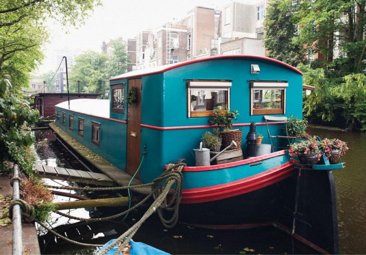
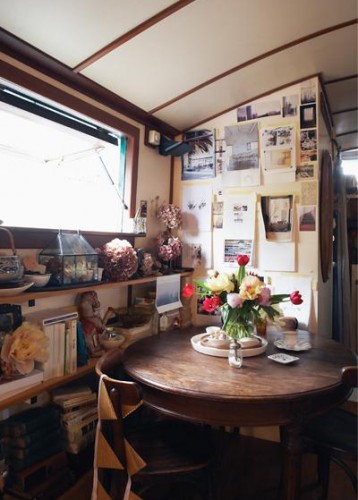
Pia Jane Bijkerk, Amsterdam. Text by Kate Veling, photos by Alan Jensen. As an internationally acclaimed stylist, blogger, photographer, and author specializing in interiors, still life, and food, Pia divides her time between Sydney, Paris, and her houseboat, actually a century-old barge that has been converted. Her home is her workshop, and although the space is small, Pia finds endless inspiration there. But she can’t adopt too many of the lovely things she comes across in her work. “Living in the houseboat has been the ultimate test in my ability to restrain myself,” she says. “I think the rule with any small space like this is one thing in, one thing out.”
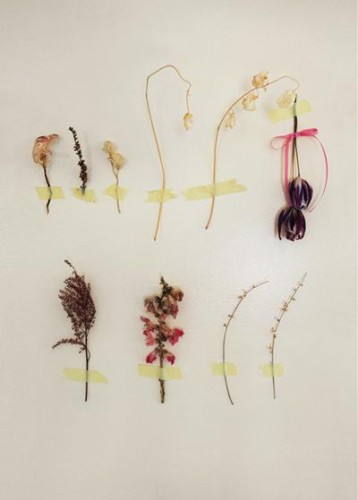
Pia Jane Bijkerk: As you would expect from a stylist, Pia’s home is a thing of beauty. “There are two words I like together — raw and sophisticated,” she says. Furnishings feature tasteful neutrals with lots of texture, while feathers, dried flowers, and collages of things that take her fancy are taped to the wall.
Pia Jane Bijkerk: Every shelf and surface is filled with a delightful jumble of books, crockery, ornaments, vases, and amber glassware. Pia’s favorite piece of furniture is the 1920s oak dining table. “I bought it at a flea market in Paris and it is the most beautiful table to sit at as well as to photograph,” she says.
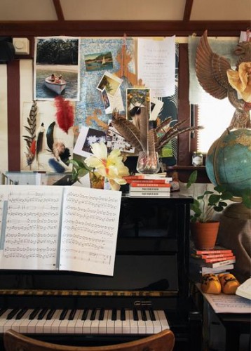
Pia Jane Bijkerk: The piano is another favorite. “I was playing piano one day in the summer with the windows open,” she recounts. “When I finished the piece, all of the sudden there was a loud clapping. I looked out the window and a small group of people in a little dinghy had turned off their motor while cruising past so they could listen to me playing. I was astounded.”
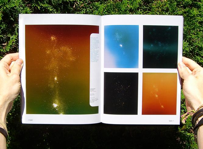
The funny thing about Death magazine — a thrice-yearly publication inviting designers, artists, and writers to use humanity's darkest subject as a creative catalyst — is that it's not really all that morbid. You'd get more depressing stuff asking musicians to write songs about love. While Portland-based graphic designer Forrest Martin was moved to found the magazine last year in part by a deep-seated fear about his eventual demise ("I'm an agnostic worrier raised by a professional hypochondriac," he told a blog at the time), his contributors filter the issue at hand through all kinds of artistic lenses, some of them masterfully subtle. In Death's recently launched second issue, Michael Zavros's lush large-scale charcoal drawings of young male models with their faces scratched out could just as easily be from an artsy spread in a fashion glossy as they could a death threat from a homicidal stalker, while photographer Jason Lazarus's super-saturated color fields, sprinkled with the cremated remains of the late artist Robert Heinecken, on first glance resemble star systems photographed in deep space.
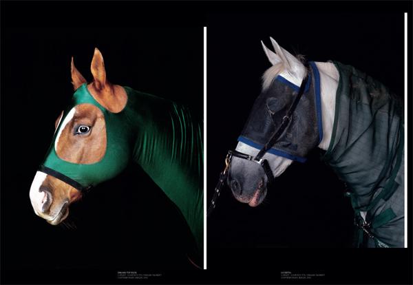
We’ve seen magazine issues themed around water, procrastination, infrastructure, age, Belgium, and sex. But horses? Not until we picked up the latest issue of one of our favorite new reads, A Guide Magazine. Conceived by the Vienna-based husband-and-wife duo of graphic designer Albert Handler and his fashion-world wife Ulrike Tschabitzer-Handler, and named for the city guides that will be available as a pullout in each issue, A Guide Magazine is a biannual publication devoted to craft and creativity.
The fourth and most recent issue of Apartamento, one of our very favorite publications, includes a special kids' supplement called Kinder, curated by Andy Beach, one of our very favorite bloggers. Apartamento bills itself as "an everyday life interiors magazine," and Kinder follows suit: There's an acid-trip of a coloring book illustrated by Andy Rementer; the Memphis-esque results of a furniture-building workshop for kids; and a story about a collection of objects that Los Angeles graphic designer Geoff McFetridge made for his daughter Frances, which is excerpted here in its entirety.