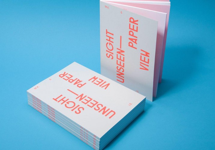
If you’ve been to one of her fashion presentations or received one of her elaborate invitations in the mail, you might be surprised to hear graphic designer and art director Roanne Adams describe her business as “not the edgiest design firm.” This, after all, is a woman who’s so well known for her career-launching work for emerging fashion stars like Abigail Lorick and Timo Weiland that brands often come crawling to her for infusions of downtown cool. Yet if she’s managed to turn RoAndCo Studio into one of the most up-and-coming boutique firms in New York at the moment, it’s because her little-known clients like Rachael Ray and Zappos have just as much respect for her work as folks like TenOverSix do, which has a lot to do with Adams’s instinctive approach to design: Rather than competing to be the most avant-garde kid on the block, she prefers putting new twists on familiar ideas from the past, researching a brand’s history or creating narratives around those who don’t have one. Her inspirations, as enumerated in the pages of our book Paper View and brought to life here, run to the likes of Guy Bourdin and ’70s advertising icons. “I’ve always been more into Paul Rand and Herb Lubalin than any contemporary designers,” she says.
Which isn’t to say she’s some kind of design Luddite, of course. She’s just well balanced. As an undergrad at Parsons, she was “designing weird stuff — bizarre magazines and experimental books,” she says, and interning for Stella Bugbee at Honest. But her first job out of school was at Wolff Olins, where her pet project was rebranding the kids’ clothing giant Osh Kosh. “Being put in that environment was like using opposite side of my brain. Suddenly I had to appeal to the lowest common denominator and explain things to people who were all about driving numbers. It was nice to have an experience in a small firm that liked to poke fun at capitalism, then go to an environment where they embraced it.” That knowledge has actually come to define her work, in a way, since she set up her own studio in 2006: The fledgling fashion houses she built her roster with weren’t just getting logos and catalogs from her, but full-service creative direction, and by extension, business consulting. Adams still likes taking on new brands that let her wade elbow-deep into their debuts, though her goal is always to set them up “so they can kind of do it themselves at a certain point,” she says. “It’s like teaching them how to ride a bike.”
Even with her more established clients, though, she does tend to do a little bit of everything, creatively speaking. It’s that control-freak thing that more than a few designers share, the urge to script all the parts of a brand’s story rather than just the one that ends up on paper. Adams art-directs many of her clients’ lookbook shoots, and she’s known for her immersive fashion week presentation sets, starting with the decadently dystopian world she crafted for Lorick in 2008. “We once did a show for Rachel Antonoff on the Lower East Side where we called it a school play rehearsal, with a cardboard piano and the girls dressed up in tutus,” she says. “And for the spring ’11 Honor show, which was inspired by French New Wave and Wall Street in the ’80s, the space looked like a place where bad things happen. So it was about this Belle de Jour woman who’s seemingly perfect but has this bad side.” To create all this imagery and give it dimension takes a wellspring of such references — check out the slideshow at right to discover the ones Adams turns to most often these days, then follow this link to purchase a copy of Paper View, where you’ll find eight other such inspiration lists from folks like Sebastian Wrong of Established & Sons and Pin-Up’s Felix Burrichter.
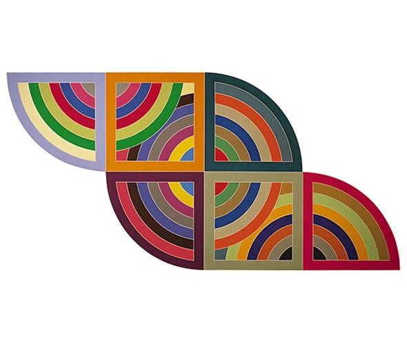
Post-Painterly Abstraction: “I’m really into post-painterly abstraction, late-’60s and early-’70s graphic paintings by the likes of Frank Stella and Larry Zox. I love the use of color and shape. Color blocking has become a recent theme in my work, maybe because it’s such a big trend in fashion.” Above: Frank Stella’s Harran ii, 1967
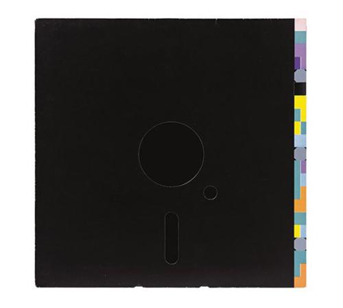
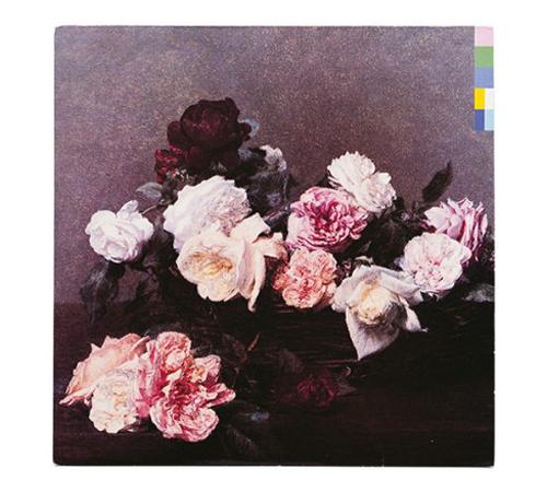
Peter Saville: “Peter Saville has been a pivotal figure in graphic design and style culture since his work for Factory Records in the late ’70s. I’ve always admired him, and we recently used his iconic album covers for Joy Division and New Order as inspiration for a branding project.”
Peter Saville: “Saville’s work is refined and modern, and he communicates with imagery in an elegant way that’s both conceptual and simple—qualities I strive for in everything I create. What’s most enviable about his work is the amount of freedom he had with client projects, which is a rare luxury for designers.”
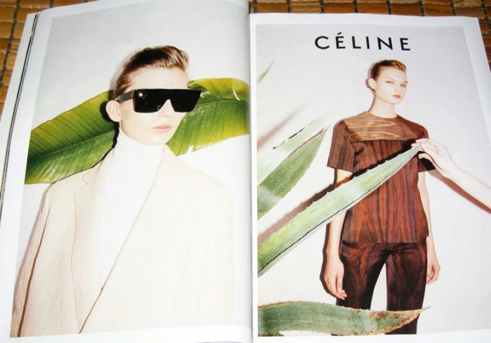
Celine: “In the world of fashion branding, Celine is currently at the top of my list for making a huge comeback and leading the way. I love everything from the logo to the bold ad campaigns shot by Juergen Teller. Simple, clean, and contemporary, Celine’s message manages to cut through all the fashion mess—always the ideal when developing branding in any field.”
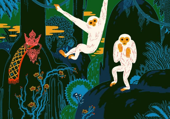
Micah Lidberg: “I love Micah Lidberg’s illustrations on so many levels: They’re super weird, totally beautiful, and have amazing color palettes. Their strange combination of objects, quirky characters, and little idiosyncrasies are what make them so great.”
Micah Lidberg: “For such detailed pieces with so much going on, I admire how they avoid appearing too cluttered or difficult to look at.”
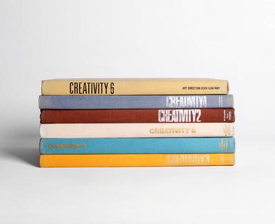
Creativity series: “My mother-in-law is a library volunteer, and she’s helped me build a library of my own with vintage graphic design and art direction books. My favorite and most influential books are the ones in the now-defunct Creativity series by the Art Direction Book Co. While the design annuals are a fantastic source of inspiration, unfortunately they remind me that everything has already been done!”
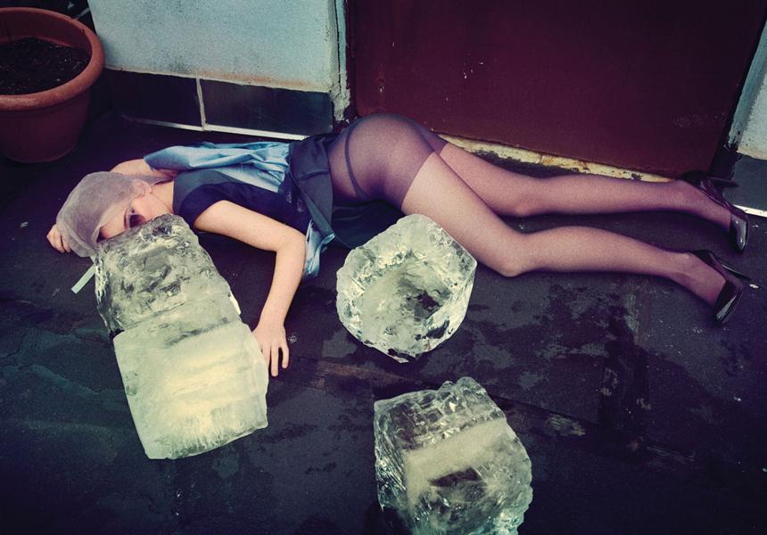
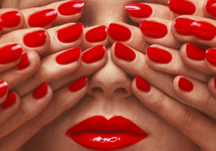
Guy Bourdin: “Whenever I’m art directing fashion photo shoots, I often reference Guy Bourdin. I really appreciate his graphic images and simple compositions, as well as his habit of always shooting with a narrative in mind. I like to approach photo shoots with a story or narrative, even if it’s only subtly implied. A strong feeling—whether it’s sensual, provocative, shocking, exotic, surrealistic, or even sinister—makes whatever image you associate with a fashion item that much more compelling.”
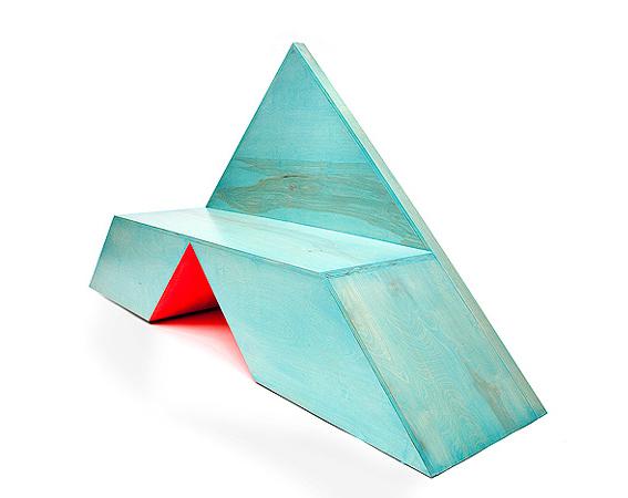
Wooden furniture in color: “We recently built a wooden bookshelf and lacquered the interior shelves with bright orange; I love the juxtaposition of wood grain with bright color. I also like the work of the designer Rafael De Cardenas, who uses brilliant color combinations and geometric shapes in his furniture—this is clearly a recurring theme for me!” Above: De Cardenas’s TRI Bench for Johnson Trading Gallery
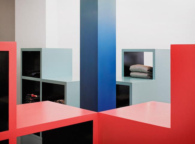
Wooden furniture in color: De Cardenas’s interior for Unknown Union in Cape Town
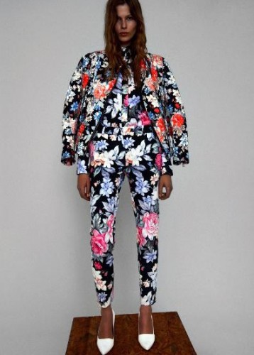
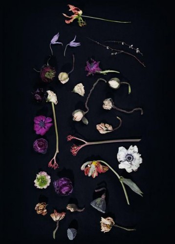
Florals: “We recently art directed a campaign shoot for Candela that used huge floral arrangements and wreaths by Taylor Patterson. The flowers were shot against a black background, and they were a beautiful complement to the otherwise dark mood of the images. I’ve always opted for poppies and wild flowers over roses, but I’ve suddenly found a new love for all things floral.”
An image from RoAndCo’s floral shoot with Tom Hines, for Candela’s fall/winter ’12 campaign
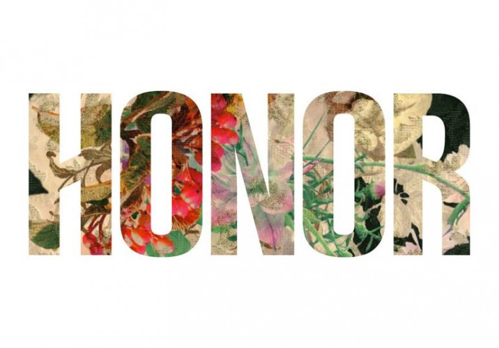
A floral twist on the logo the firm developed for womenswear line Honor in 2010
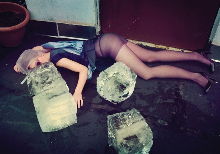
A Guy Bourdin-esque image from the fall/winter ’09 campaign for Lorick, art directed by RoAndCo
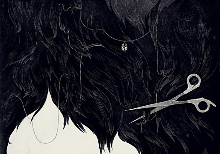
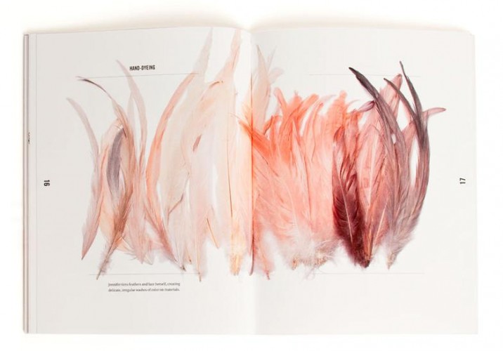
A spread from RoAndCo’s brand book for luxury hair accessory designer Jennifer Behr
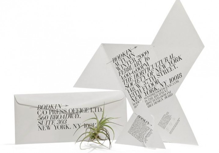
The invitation to eco-focused label Bodkin’s fall ’09 presentation, which took the form of a Buckminster Fuller–inspired tetrahedron containing a living air plant
One of the firm’s more intimate client projects involved collaborating on a textile design for Arnsdorf’s spring/summer ’11 collection, which went on to become an iPhone cover and laptop skin in RoAndCo’s Society 6 store
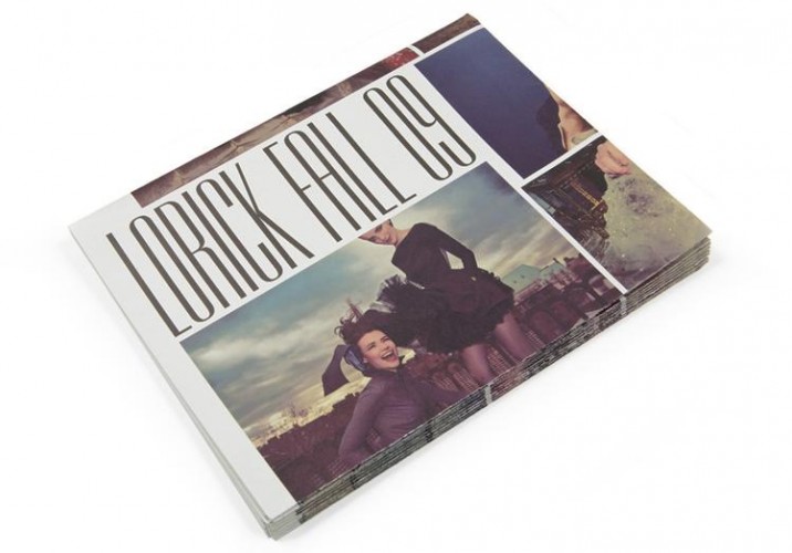
Lorick’s fall ’09 lookbook
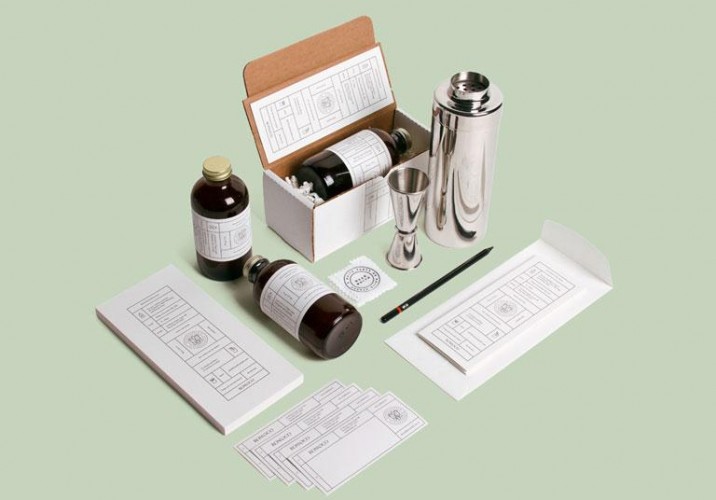
A particularly elaborate in-house project: The invitation to last year’s RoAndCo holiday gathering, which contained a custom-labeled bottle of Morris Kitchen’s ginger syrup and related cocktail recipes
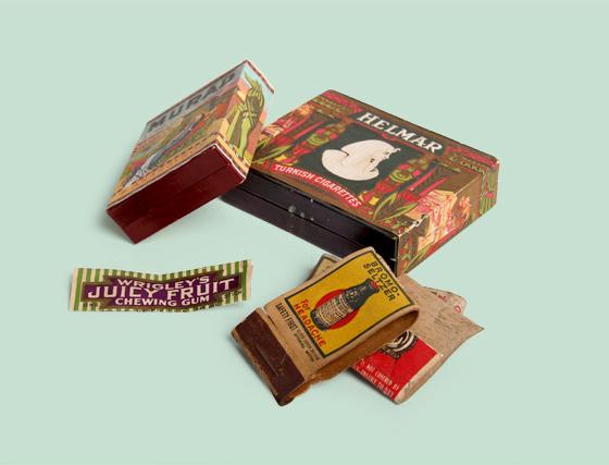
Sighted today on the blog of RoAndCo — the up-and-coming, ADC-award-winning design agency run by our friend Roanne Adams — a beautifully presented series of old treasures discovered under a client's floorboards. Writes Adams: "All too often our NYC paced lifestyles make it easy to forget that the buildings we walk by and work in every day have stories to tell. Our friends and clients at Projective Space recently found some treasures hidden under floorboards while renovating their new Lower East Side space, and we thought they were too beautiful to not share! We did a little research and found that both cigarette boxes date back to 1910 and feature artwork inspired by Owen Jones, a London-born architect who reproduced the ornate designs he found while traveling in Asia, the Middle East, North Africa, and India. We thought it was pretty funny that the design for the Turkish Cigarettes packaging clearly took its style cues from Egypt. The Juicy Fruit wrapper and matchbooks all date back to the 1920s. One of the matchbooks actually has an ad for life insurance: $5,000 worth of coverage for 5 bucks!" Click through for more images.
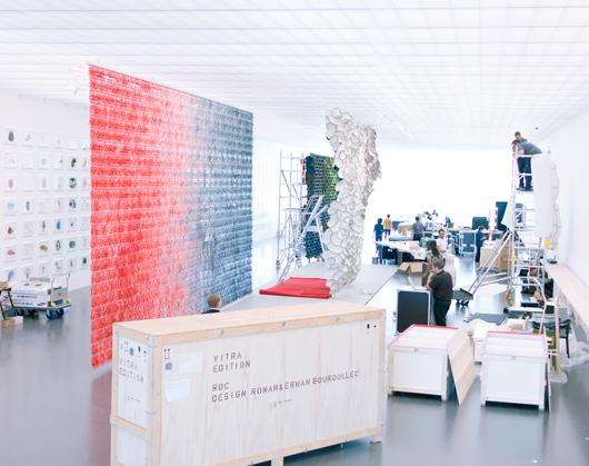
Designers around the world owe Johanna Agerman Ross a drink, or perhaps even a hug: Her new project, the biannual magazine Disegno, is devoted to letting their work breathe. “I always found it frustrating working for a monthly, because I couldn’t give a subject enough time or space to make it worthwhile,” says the former Icon editor. “For a project that took 10 or 15 years to make, it felt bizarre to represent it in one image, or four pages.” Founded by her and produced with the help of creative director Daren Ellis, Disegno takes some of the visual tropes of fashion magazines — long pictorial features, single-photo spreads, conceptual photography — and marries them with the format of a textbook* and the investigative-reporting ambitions of The New Yorker. The story about Ronan and Erwan Bouroullec which we’ve excerpted here, for example, fills 22 pages of the new issue and runs to nearly 3,000 words; it’s accompanied by images captured over two full days the photographer spent with the brothers, one in their studio and one at the Centre Pompidou-Metz, where they were installing their latest retrospective, “Bivouac.” And articles on Martin Szekely, Azzedine Alaïa, and Issey Miyake’s Yoshiyuki Miyamae are set either over lunch, or in the subject’s living room. The focus, says Agerman Ross, is on proper storytelling. “The people behind the project, the process of making something, even the process of the writer finding out about the story — that’s all part of it,” she says. “It’s the new journalism.” Obviously, we couldn’t agree more.
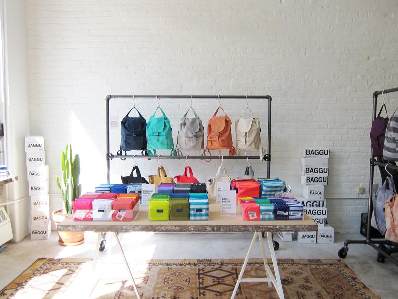
“Always listen to your mother” isn’t exactly the kind of central tenet they teach you at Harvard Business School. But for Emily Sugihara, the California-raised, Brooklyn-based designer behind the reusable bag line Baggu, it’s a piece of advice that’s been invaluable to the brand’s runaway success since its founding in 2007. Back then Sugihara was a Parsons grad working as an assistant designer at J. Crew, just coming to realize that a corporate job wasn’t her calling. “As a kid, I was very entrepreneurial, and I always knew I wanted to have my own company,” she says. At home over Christmas break one year, Sugihara and her mother began talking about making a line of reusable shopping bags. Her mom was “sort of a treehugger” and an artist in her own right — an expert seamstress who learned to sew making her own clothes as a kid in rural Michigan — and Sugihara was a die-hard New Yorker-in-training, sporting fingers turned purple each week as she lugged home bags full of groceries. Together they came up with a bag that’s almost exactly like the original ripstop nylon Baggu that sells today: long handles that fit comfortably over the shoulder, gussets along the bottom that allow things like milk and eggs to stack, and a single, double-reinforced seam that’s the result, Sugihara says, of her mother’s “sewing genius.”