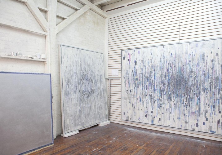
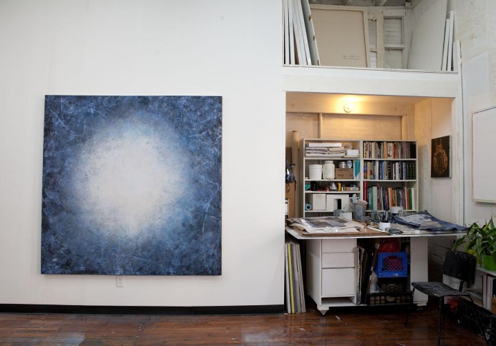
To get an idea of how Ryan Wallace approaches materials, look no further than one of the walls of his studio, paneled with the kind of slatboard that a Chinatown souvenir shop might use to stack metal shelves full of I ♥ New York T-shirts. When Wallace found the studio last year, it was perfect otherwise — a clean, well-lit space above Paulie Gee’s pizza in Greenpoint, Brooklyn, right near his apartment. “At first I thought the wall was kind of gross,” he says. But he slowly began to accept it on a purely functional level; the way things could be hung at different heights was ideal for a painter. “I thought, ‘What can I do with this?’ A thing like that gets planted in my head, and eventually it finds its way into the next thing I’m doing.”
If this open-minded approach to materials is the foundation of Wallace’s work, an interest in existential scientific questions is its overriding concept. Growing up on the East Coast, Wallace was never particularly spiritual or religious, but he always found himself reading special editions of Time about the latest theories of the universe. His formal education at RISD only proved to him that artists and scientists are more alike than not. “We’re both on some sort of quest for discovery,” he says. He’s been fascinated in recent years by the Large Hadron Collider at CERN, which served as an inspiration point for his one-man show at Morgan Lehman Gallery earlier this year. For “Cusp,” he created three new series of abstract paintings — Glean, Atlas, and Tablet — which, as their names suggest, meditate on information overload, geography, and data in different visual ways. From a purely material perspective, they use soft solids like oil, enamel, ink, graphite, PVA, Mylar, artist tape, and cut paper, stretched and bound and sorted and scored into a four-cornered ordered object. As physical objects, however, they are layered and compressed with so much visual data that they become, as Wallace puts it, “a surface that stores information.”
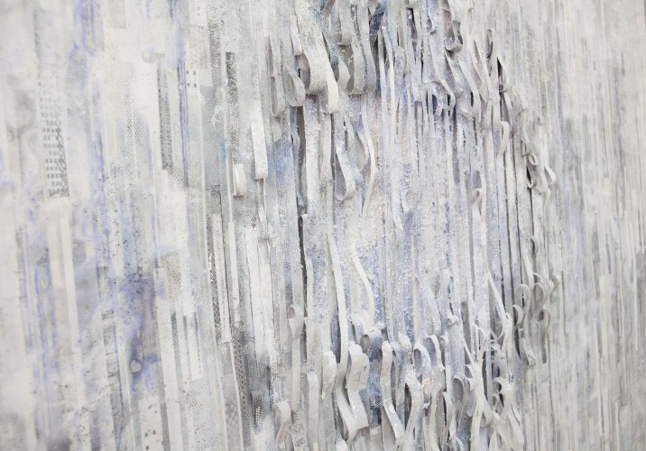
To create the pieces in his new series, Wallace began cutting into the paintings and building them from the inside out. The collage-based paintings consist of a fastidious arrangement of hundreds of tiny pieces of paper and tape leftover from other projects. A sheet of Mylar is glued over the whole thing, leaving random-looking air bubbles in pockets over the piece. “The Mylar gives this kind of neurotic process an element of total chance,” he says. “If it was just little things arranged on a surface, it would be too design-y for me.” But it’s also consistent with his process. “I never use anything the right way,” he says. “You’re definitely not supposed to wrap a canvas in Mylar.”
Using materials the wrong way, however, seems to bring serendipitous results. A series of freestanding vitrines for his show at Morgan Lehmann used automotive tints and one-way mirror film to raise some plaster casts he’d made of ordinary rocks to the status of sacred object. “My work’s not sarcastic in this way, but I’m using stuff that 16-year-olds put on their Civics to be macho and fancy,” Wallace says. “And at the end of the day, I also think they’re really beautiful. Whenever I go from painting to printmaking to sculpture, it’s always about what can this medium do that that medium can’t do.”
For Wallace, a little discovery — like how his Mylar paintings ended up having a waxy surface texture — can result in an entire body of work. He even found a couple of 4x8s of his studio’s god-awful paneling in the stairwell of the building earlier this year, and he’s now begun using it to make pedestals. He even may be beginning to like it. “It’s scrappy, it’s industrial,” he says, listing off a few adjectives he considers compliments. “And it’s got this design element to it, but it’s a crummy one. That balance of elegance and crum is really important to me.”
Last May, he founded the East Hampton gallery Halsey Mckay with the curator Hilary Schaffner. On September 1, they’ll open the newest exhibition in the space, a two-person exhibition of works by David Kennedy Cutler and Elise Ferguson. For a closer glimpse inside Wallace’s own world, however, read on.
Tablet series (far left), Glean series (middle), and Atlas: “I started out making maximalist narrative paintings, but the backgrounds became more interesting to me, and eventually they became the painting: That’s what the Glean and Atlas paintings are. At first, the Atlas paintings were easier to make on wood panel, but I wanted them to be on canvas, so that they’d stay within the canon of painting on some level. Plus, old ladies like their oils on canvas, so I was trying to find a way to make them on canvas that wasn’t just for ‘marketing’ purposes — certain collectors just won’t touch wood panel. I had to think about why these paintings needed to be on canvas if it’s easier on panel. Then I thought of slashing the surface — Lucio Fontana would be the obvious example— and that led me to cutting them and pulling them and then it just became a whole new body of work that had to be on canvas.”
Close-up of the Glean series: “The Glean paintings are more layered on top with paper and patterns from my own lithographic process. What’s left over will get collaged in, so there’s a physical link between each type of work. But then I cut through and rip the back out, so it’s just the Mylar holding it together. I was thinking about what a painting would look like if it were to construct itself, without the artist’s hand there. Could it also be disintegrating? I like that it’s this gray area of whether this thing is assembling itself or is it being destroyed.”
Tablet, (White), 2012: “Tablet is the complete opposite, visually. And since the sides are sometimes painted, they could also be interpreted as being physically ripped out of the other paintings.”
Detail of Tablet “This series is about reduction. I’m making the central part of the painting this void, which sort of negates the parts that are centrally active. I’m interested to think in terms of whether these are really humongous or really small, whether you’re seeing something micro or macro.”
Two Tablet paintings: “Sometimes they have the Mylar on the edges but the middle is just oil and enamel built up with small brushes in this scumbly technique. What I always loved about those old Mark Rothko pantings is those blurry edges that each shape has so I played with that scumbly edge.”
Interior shot of studio with Omega Point: “On this painting, I used an industrial vinyl screen that’s used on buses. I stumbled on this process through the artist Glenn Baldridge, actually — he did a sunset like the one he did at BAM at our gallery, and when we peeled it off at the gallery, I thought it was perfect. It’s made up of all these tiny circles that are holes that you can press wax and oil paint through. It’s very imperfect but it leaves a pattern. And it’s a more physical way to make a pattern than the lithograph process. I wanted it to make a mess but still retain a form of non-human mark-making.”
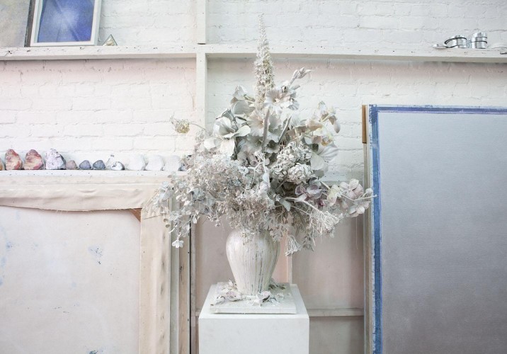
One of three sculptures called Still Life: “These were shown at Zieher Smith last summer in a group show called Grasping for Relics, curated by Patrick Brennan. These floral arrangement sculptures are made with silk and vinyl flowers dipped in vats of enamel, glass, hot glue, paste, plaster, oil, shellac, chrystallina.”
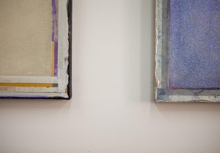
Metallized Mylar tape and white artist tape: “I started using Mylar in 2008. At the time, I was mixing a lot of cut paper paintings that had more naturalistic elements like trees or figures, and I was looking for different surfaces to paint on to make them more interesting — sometimes I would paint over Xeroxes, or on drawing paper and cut that out. I got the Mylar because I could paint on the back and it held the paint differently. I had it lying around and I thought, what if I covered a whole painting in this? Usually I use a big 50-inch roll and cut into big sheets and glue down.”
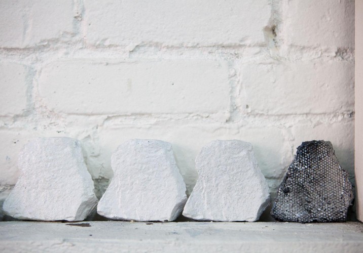
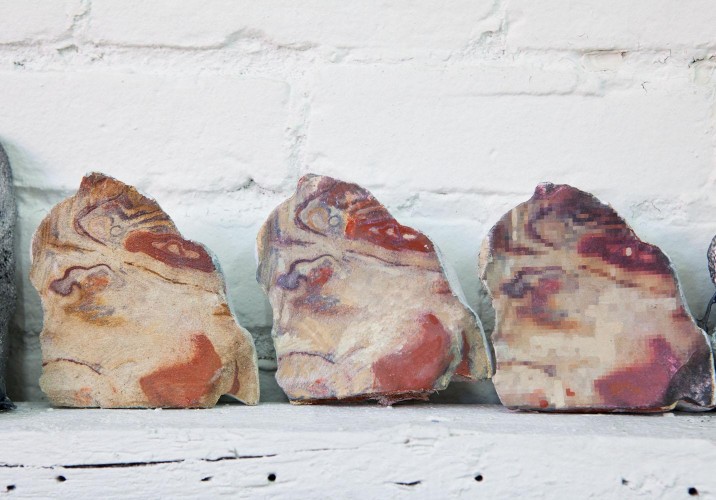
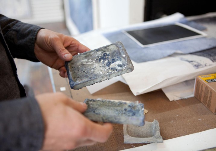
“These were in the show at Morgan Lehman. They’re limestone, cement, and Alumilite resin. Some are real and some are in the process of being painted to either look real or like pixilated versions. I found some limestones when I moved into a former studio, and I made latex molds of them and then cast those molds. I got interested in them precisely because they weren’t exciting. I just started thinking about Northern California rocks and how people say they have all these powers, and I thought it could be interesting if you made this mini-Stonehenge from rocks that weren’t particularly exciting. I found a master mold-maker who does natural history museum stuff. The guy was like, ‘Why do you want to do these rocks, why don’t you do some nice rocks?’”
“Just by putting them in these formations and in vitrines, they take on this loaded meaning. And they pose technical, artistic challenges, but they didn’t need to be spectacular. I made one out of concrete and the rest out of alumilite resin, which is just a sculptor’s tool. And I like the way they come back to the way that I’m not a scientist but just an enthusiast. Using latex molds to make fake rocks is the most popular thing to do for draft hobbyists. It’s really easy, you just cast a rock and daub it with gray paint and you have the perfect looking rock. But I wanted to take this hobbyist’s novice tool and use it in a really refined way.”
“This is a book that Halsey Mckay published. It’s a monograph by the artist Patrick Brennan, and the title comes from a poem written by Lauren VHS. The poem is inspired by Patrick’s work and is included in the book.”
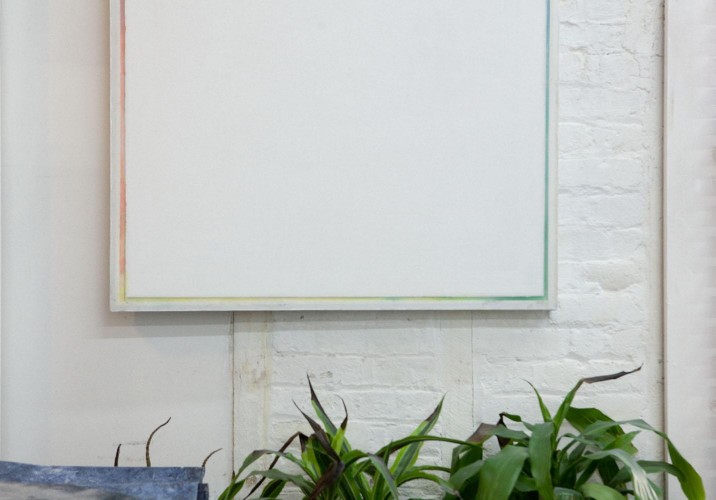
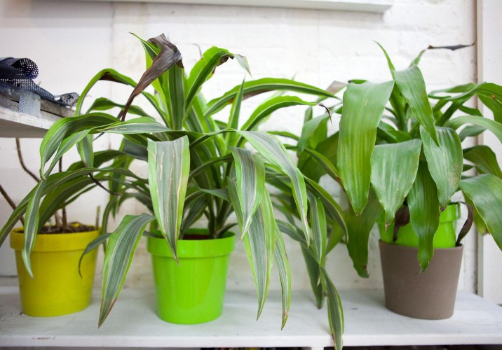
“Plants. They just make the place feel good.”
Some old gloves.
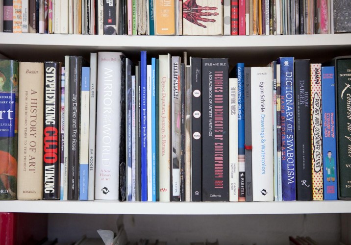
“The Stephen King book is actually a Warren Neidich piece from this show at Glenn Horowitz Bookseller in East Hampton, 2010. He made this beautiful constructivist bookshelf with all of the books that Sarah Palin supposedly wanted banned from her local library in Alaska. If you brought in any book that was the color red, you could take one of the books from the shelf, which is signed and marked as a part of this piece. I took Cujo.”
“I use a lot of raw pigment and powders that are even more horrible than spray enamel, which I also use.”
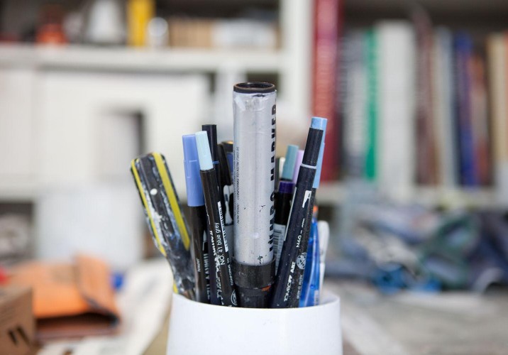
Markers and pens and a screwdriver.
“I’ve found that iPod and iPhone plastic cases are the best tool for squeezing out the glue, like a squeegee, when I adhere the large sheets of Mylar to the surface of the paintings. I’ve also used broken iPods for this. The rounded edges and the size just work better than any real tool. The two pieces that I’m holding are gunked up with glue and paint. You can see half of the top piece that holds the iPod in place there on the table.”
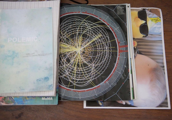
“Polemic was published on the occasion of a two-person show with Chris Duncan earlier this year at Cooper Cole Gallery in Toronto. (((Ω.))) is a book also by me, published by Land and Sea, with an article about the large Hadron collider from Discover, a DeKooning catalog from the recent MoMA retrospective, and a photo of my son and a duck wearing the same sunglasses.”
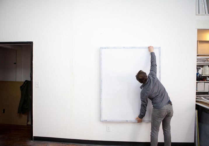
Wallace in the studio, adjusting Tablet, (White), 2012.
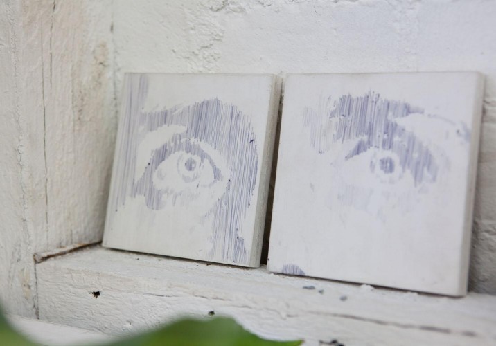
“These are pen on Mylar, based on a famous photo of Ian Curtis. They were for a show years ago curated by Jordin Isip and Roger Stephens, where a load of artists each got those two panels and had to make an eye on each one. They have been co-curating these large, thematic group shows for at least a decade now. They are great.”
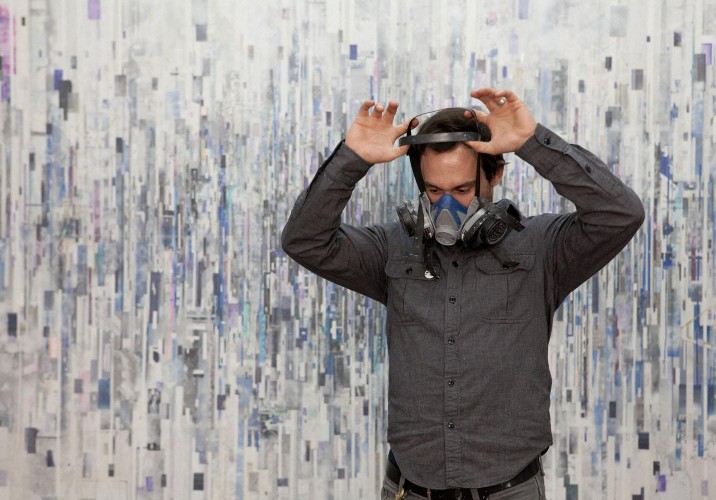
Wallace in his studio, January, 2012.
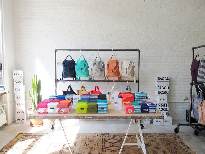
“Always listen to your mother” isn’t exactly the kind of central tenet they teach you at Harvard Business School. But for Emily Sugihara, the California-raised, Brooklyn-based designer behind the reusable bag line Baggu, it’s a piece of advice that’s been invaluable to the brand’s runaway success since its founding in 2007. Back then Sugihara was a Parsons grad working as an assistant designer at J. Crew, just coming to realize that a corporate job wasn’t her calling. “As a kid, I was very entrepreneurial, and I always knew I wanted to have my own company,” she says. At home over Christmas break one year, Sugihara and her mother began talking about making a line of reusable shopping bags. Her mom was “sort of a treehugger” and an artist in her own right — an expert seamstress who learned to sew making her own clothes as a kid in rural Michigan — and Sugihara was a die-hard New Yorker-in-training, sporting fingers turned purple each week as she lugged home bags full of groceries. Together they came up with a bag that’s almost exactly like the original ripstop nylon Baggu that sells today: long handles that fit comfortably over the shoulder, gussets along the bottom that allow things like milk and eggs to stack, and a single, double-reinforced seam that’s the result, Sugihara says, of her mother’s “sewing genius.”
It gyrates, it whirs, and it's every bit the mechanically-powered spectacle of a department-store Christmas Village: Italian furniture brand Moroso's New York showroom has been transformed into a jolly urban landscape of brightly colored kinetic skyscrapers, an immersive installation created by the young Italian artist Anna Galtarossa. Woven amongst the shop's Tord Boontje lounge chairs and Front sofas, Galtarossa's fabric buildings were commissioned by company founder Patrizia Moroso as part of a newly launched grant project called the Moroso Award for Contemporary Art. Curated in partnership with the Civic Gallery of Contemporary Art in Monfalcone — along with a guest panel of design-industry talents like Tobias Rehberger, David Adjaye, and Patricia Urquiola — the award will fund not only Galtarossa's New York project but planned installations by additional 2011 recipients Martino Gamper and Christian Frosi. But even more, it serves Moroso's own effort to expand her support to art, a creative discipline that has lost crucial government funding in recent years, by highlighting its potential to impact the practice of design. We recently spoke with both Moroso and Galtarossa about the ways art and design can influence one another, and how Galtarossa's Skyscraper Nursery embodies those ideas.
Designers around the world owe Johanna Agerman Ross a drink, or perhaps even a hug: Her new project, the biannual magazine Disegno, is devoted to letting their work breathe. “I always found it frustrating working for a monthly, because I couldn’t give a subject enough time or space to make it worthwhile,” says the former Icon editor. “For a project that took 10 or 15 years to make, it felt bizarre to represent it in one image, or four pages.” Founded by her and produced with the help of creative director Daren Ellis, Disegno takes some of the visual tropes of fashion magazines — long pictorial features, single-photo spreads, conceptual photography — and marries them with the format of a textbook* and the investigative-reporting ambitions of The New Yorker. The story about Ronan and Erwan Bouroullec which we’ve excerpted here, for example, fills 22 pages of the new issue and runs to nearly 3,000 words; it’s accompanied by images captured over two full days the photographer spent with the brothers, one in their studio and one at the Centre Pompidou-Metz, where they were installing their latest retrospective, “Bivouac.” And articles on Martin Szekely, Azzedine Alaïa, and Issey Miyake’s Yoshiyuki Miyamae are set either over lunch, or in the subject’s living room. The focus, says Agerman Ross, is on proper storytelling. “The people behind the project, the process of making something, even the process of the writer finding out about the story — that’s all part of it,” she says. “It’s the new journalism.” Obviously, we couldn’t agree more.