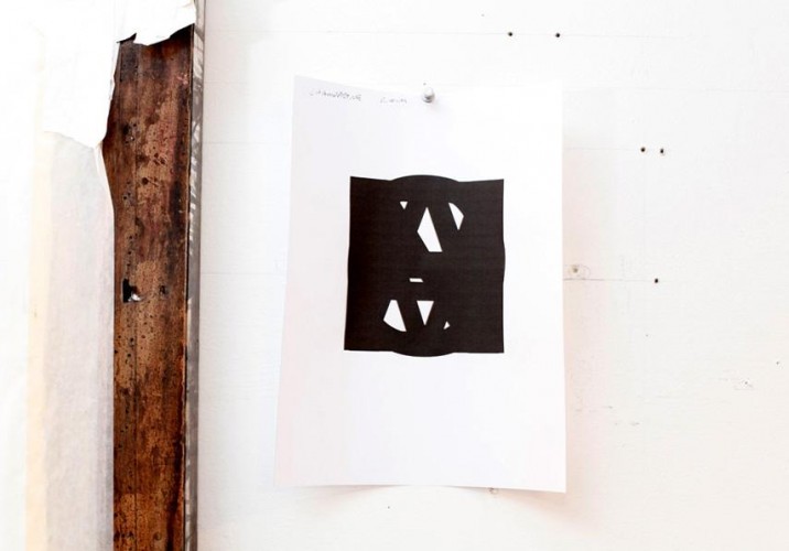
Evan Gruzis explored altered states of awareness a few years back, and while he was wigging out, managed to scrawl down such revelatory thoughts as “there once was a movie, it was amazing”; “welcome to the temple of showers, please take a shower in one of our many showers”; and “no bother, it’s just the remix.” Having rediscovered the notes recently, he turned them into a series of works on paper by scanning and enlarging them, cutting out the individual letters, then sweeping over the cutouts with the flat, ’80s-style gradient that forms the background for many of his works, including semi-photorealistic still lifes and geometric abstractions inspired by Saved by the Bell and Memphis. Rather than using an airbrush — “blasphemy!” according to the 31-year-old artist — Gruzis builds up the gradients in meticulous layers of India ink, spreading upwards of 20 separate washes across wet paper with soft squirrel-hair paintbrushes until the effect is practically flawless. “It’s about taking a moment that isn’t even remembered and turning it into this layered, highly crafted, highly rendered thing,” he explains of the acid notes, the kind of process that keeps him locked away in his studio six days a week. “It’s about taking meaninglessness and glorifying it. That’s another way of putting what I do: Making absurdity seductive, and making the seductive vapid, so you get caught in this feedback loop.”
It’s that approach — applied to similarly trite subjects like digital alarm clocks, Florida boardwalk t-shirts, and wayfarer sunglasses, which he’s painted onto faceless men or turned into marble sculptures — that won Gruzis his spot in Jeffrey Deitch’s stable in 2008, while he was in his final year of graduate school at Hunter. (He’s since followed Deitch director Kathy Grayson to The Hole, where he’ll have a solo show this fall.) Indeed, Gruzis isn’t just a hipster who got lucky: Before he arrived on the doorstep of sarcasm, he was actually attempting to take the high road, as a traditional oil painter with a focus on landscape. “I was living in L.A., doing this dark, Albert Pinkham Ryder, romantic-but-simple, neo–Edward Hopper bullshit,” the Milwaukee native recalls. “I got turned down a lot; people weren’t really responding to it. So out of a reflex of shame and frustration, irony entered the work.” His landscapes became cityscapes, and the cityscapes became punctuated by random bursts of pop culture. “I’d do a peach sunset with the word ‘awesome’ because I didn’t care anymore, in a way. Then I was like, maybe there’s something to this romantic oil painting with this totally cool flippant attitude, and I tried to rationalize the combination.” The moment it got him into Hunter, he didn’t need any more convincing.
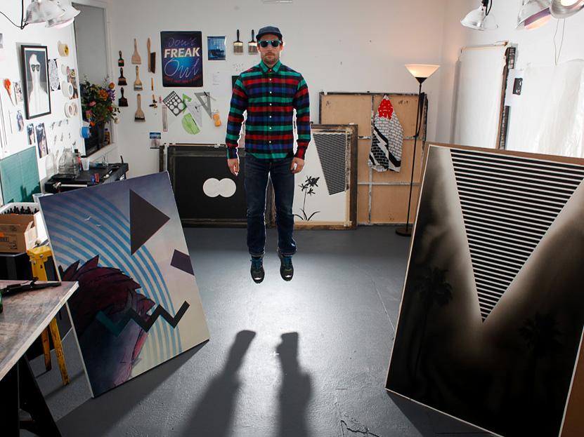
When Sight Unseen visited Gruzis’s Brooklyn studio earlier this winter, he gave us a deeper insight into both sides of his work: The cool conceptualism and the traditional craftsmanship, an alchemical combination that’s since earned him an admirable measure of success. When we arrived, he was knee-deep in preparations for his fall show at The Hole, which — among other things — you can enjoy a glimpse at in the slideshow at right.
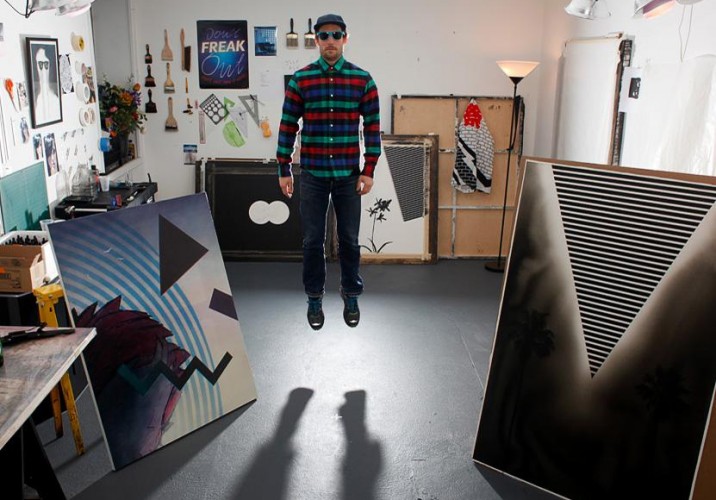
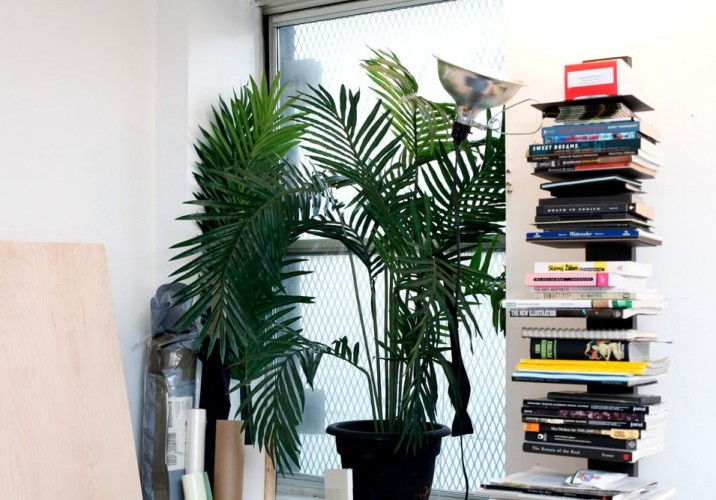
Gruzis in his studio, in the Red Hook neighborhood of Brooklyn. He bikes there from his apartment in nearby Carroll Gardens six days a week. “I made art all the time as a kid,” he says. “I was an only child, so I just shut out the world and hung out in my own space — which I still do today, all day every day. I never really planned on being an artist, but I couldn’t really think of anything else I wanted to do, and I don’t like working for other people.” The two paintings in the foreground typify his aesthetic, which is inspired by the likes of Memphis, Saved by the Bell, and Patrick Nagel. The one on the left is actually part of a series painted over digital prints of cheesy beach tees he bought in Florida.
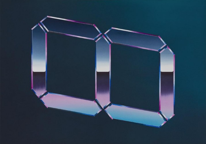
Gruzis’s father is also an inspiration of sorts. “My dad was a graphic designer, so I was always around those elements, and they really entered my psyche,” he says. “A lot of my work has no horizon line — even the landscape paintings I was doing in L.A. — so there’s a sense of weightlessness. When it does have a horizon line, there’s no depth. My dad was more corporate than avant-garde, though; he mostly made radio station logos, graphics for magazines, and work for agricultural companies. He was big into sci-fi, so that also augmented my taste.” Above: A recent painting from a series inspired by digital clocks, which Gruzis introduced at his first solo exhibition at Deitch Projects in 2008.
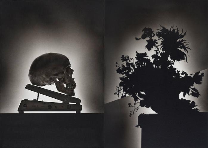
Gruzis doesn’t like to ascribe meaning to his pieces — “that’s the payoff for the viewer; I personally don’t care” — but that in itself forms the idea behind his practice. He chooses purposefully vapid subject matter like palm trees and flamingos, then renders it using rigorous traditional painting techniques, at times combining it with classical Dutch still life imagery (above) and other allusions to his high-art background. The effect sends viewers into what he describes as a “feedback loop,” where they’re searching for meaning in the works but getting conflicting signals as to whether there is, in fact, any to be found.
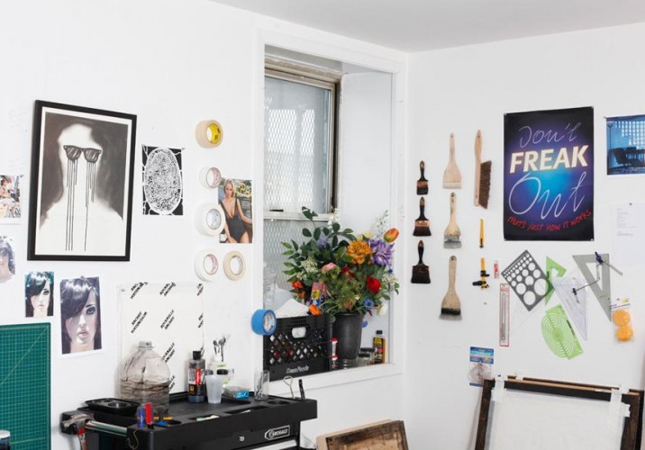
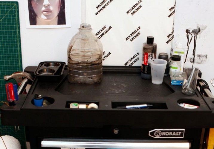
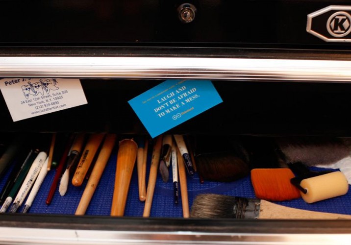
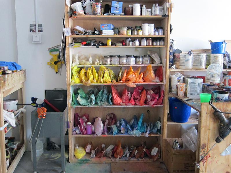
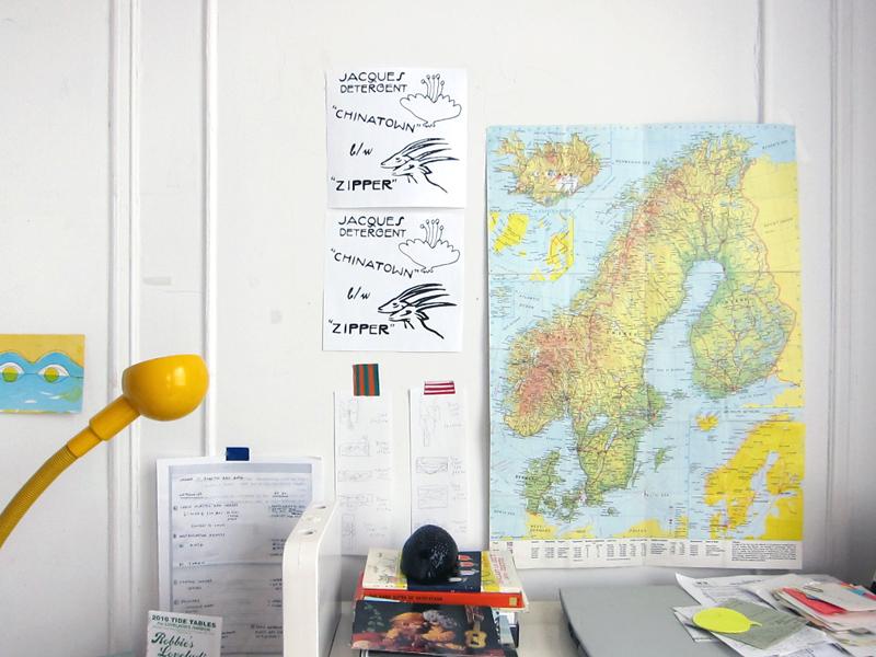
The corner of the studio holds Gruzis’s supplies, including a variety of protractors and 10 types of squirrel-hair brushes. (“When my dog comes here, he stands over by the brushes and is, like, sniffing the air,” he jokes.) Physically speaking, he starts by soaking, stretching, and sealing the edges of thick watercolor paper using traditional methods. Then he unstretches the paper, crops the edges, and begins to paint.
“As far as materials go, I’m just using India ink and watercolors,” Gruzis continues. “I could be an old grandma and be using the same materials.” In the years since he’s been working with ink, his technique has improved vastly, to the point that some of his still lifes have been mistaken for photographs. He does begin by dramatically lighting and then photographing the skulls, pineapples, and other elements present in those pieces, but solely for reference; the rest is a testament to his talent with a brush. “I don’t even mess around until I get to the finished painting, really. I pretty much make a small thumbnail sketch, then go straight to work on the final version.”
“The hardest part of making my pieces is controlling the gradients,” he says. “The way I make them is that I saturate the paper with water, brush on the ink, and move the surface around to even it out. But water and ink are so unpredictable; knowing how much ink is in the brush and where it’s going go, or how much water is in the paper, is difficult. I build the ink up very slowly, so it ends up being seamless in the end.”
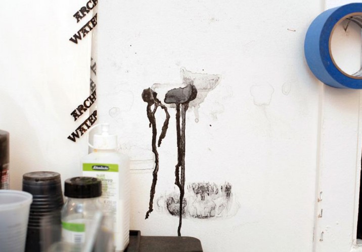
“Most of the ink ends up on the floor — here’s where the wall got it from a brush drying against it,” Gruzis says.
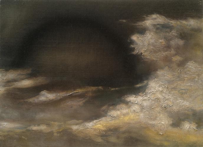
Years before Gruzis began working with ink and watercolor, though, he was using oil paints to make darkly romantic landscapes like the one above. When he found they weren’t getting him the reception in art scene that he wanted, he first began to explore incorporating irony into the work.
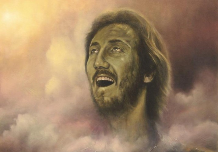
That effort led to paintings like this one, where the landscape is paired with a familiar visage. “It’s Pete Townsend from a clip of The Kids are Alright, but he looks like a zombie, and he’s in a state of pseudo-ecstacy,” Gruzis says. “I was doing a lot of music related stuff at the time; I did a painting based on the cover of ‘Hotel California.’ I wouldn’t say all of the subject matter was pulled out of my ass, I was just like, I’m going to paint whatever I want from painting to painting — it doesn’t matter.”
The new pieces got him into grad school at Hunter, for which he moved from L.A. to New York in 2005, but shortly thereafter he abandoned oil paint entirely in favor of ink and watercolor. “I kept coming up against the history of oil painting,” he says. “It has such a rich history that I think to incorporate irony and text would have made it difficult to succeed. Switching mediums and using paper — which relates to posters and has a more temporary feel — I think just read faster, even though it’s just as rich. I found that I was able to get the same sense of light on paper as I could in my paintings, which I felt was a success.”
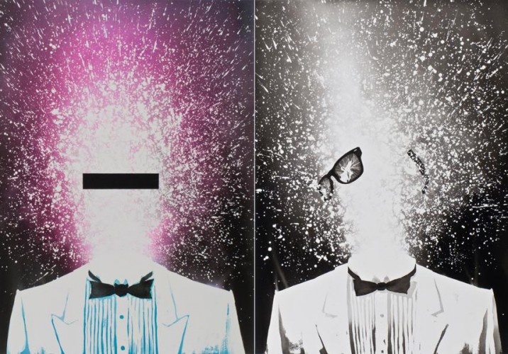
Some of Gruzis’s most-returned-to subjects, like palm trees and wayfarer sunglasses, point to the influence L.A. has had on his work. “It was definitely formative for me,” he says of his time there. “When I was growing up in Milwaukee, we had family that lived out West, so I had this fascination with California at a early age. I use California as a foil for a certain concentrated type of Americana. I think L.A. is the most American city in a lot of ways. Hollywood and the media culture impacts how we see ourselves — they make the mirror.” Gruzis tends to reference ways of seeing in his work in general, hence the sunglasses.
“The sunglasses for me are an allusion to seeing, but also to obscuring identity,” he says. “They’re also just pop culture objects that have had this classic American coolness throughout history. They’re fashionable but vapid. I started using them in 2004, kinda before they started coming back in style; I was reading Brett Easton Ellis at the time.” Pictured above are two paintings from his “Consider My Mind Blown” series, though he’s also had wayfarers hand-scuplted out of black marble and cast in bronze. “I think I’m going to be doing abstract sculptures out of broken sunglasses parts next.”
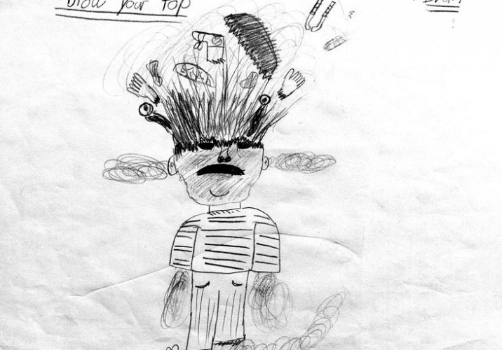
On a recent trip home to Wisconsin, Gruzis was sifting through old comics and other drawings he’d made as a kid, and was startled to find this one, which he’d long since forgotten about. “Isn’t it crazy?” he says, pointing out the uncanny parallels with the paintings in the previous slide. “It’s called ‘Blow Your Top!’”
Another reference to ways of seeing: A new canvas Gruzis had just started on when we visited his studio, which depicts a small, fuzzy image seemingly viewed through binoculars.
Gruzis holding up the source image, a zoomed-in detail of Manet’s Picnic on the Grass, which he’s blurred out. If all goes as planned, he hopes visitors will only be able to recognize the reference when they stand far enough away from the canvas.
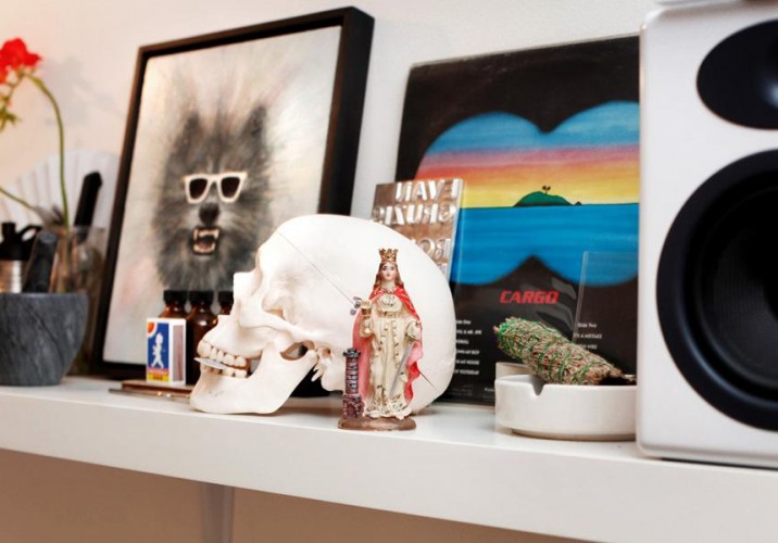
On a shelf in his studio sits the original inspiration for the binocular conceit, a Men At Work album. The shelf is Gruzis’s “shrine,” and it contains all kinds of inspiration objects, from a breakable sugar-glass prop bottle to the skull he uses for his still lifes to a figurine of Santa Barbara, the patron saint of engineers. The wolf painting in the background he considers a talisman of sorts. “I’m not going to sell that ever,” he notes.
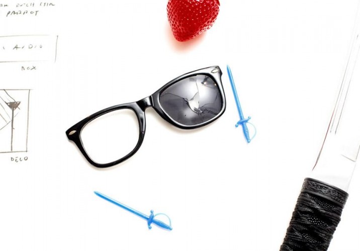
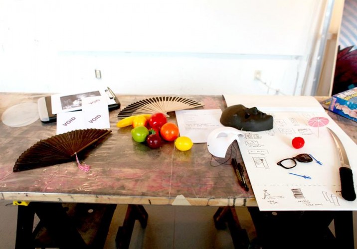
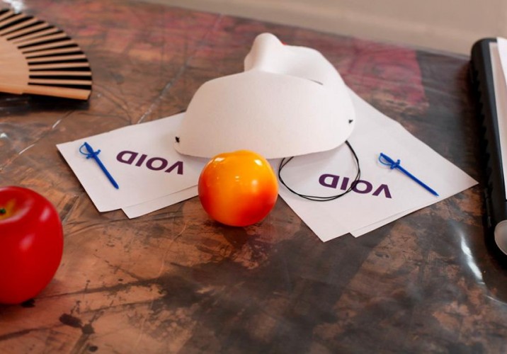
Other props spread out on a table in the studio also serve as starting points for Gruzis’s work. “Masks, knives, fake fruit, prescription labels, cocktail swords — some of them end up in my still lifes,” he says.
“Playing with objects helps me think about composition,” he adds.
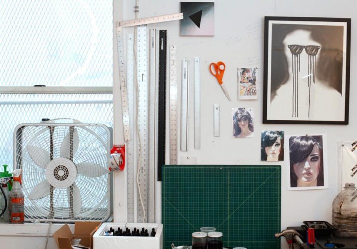
Next to one of his earlier ink pieces hang images of a mannequin Gruzis is planning to paint, plus an improbable number of rulers, which his frequent use of lines and perfect geometric shapes demands. “It seems like there are a lot of rulers and different kinds of pencils in my studio, and I think that’s partly a carry over from my dad’s influence,” he says.
Nearby is a shelf full of “books I never look at,” says Gruzis before pulling down a volume about the work of the iconic ’80s/Duran Duran illustrator Patrick Nagel. “When I was 14, I was looking at Nagel seriously,” he says. “I thought this was a serious artist, a fine artist. I had this book, and I was like, look at the line quality. Only later did I realize it’s a different subset of the art world. Following from that was my interest in Memphis: pastel colors, tile grids, a shallow sense of depth, drop shadows, geometric abstraction mixed with stylized figuration… All good stuff.”
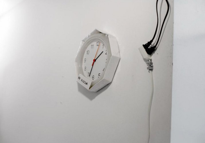
A cheap plastic wall clock from Ikea. “It’s called ‘Rusch,’ but I added a few letters with a Sharpie so the label reads ‘Ed Ruscha,’” says Gruzis.
A teal lighter Gruzis loved but has since lost.
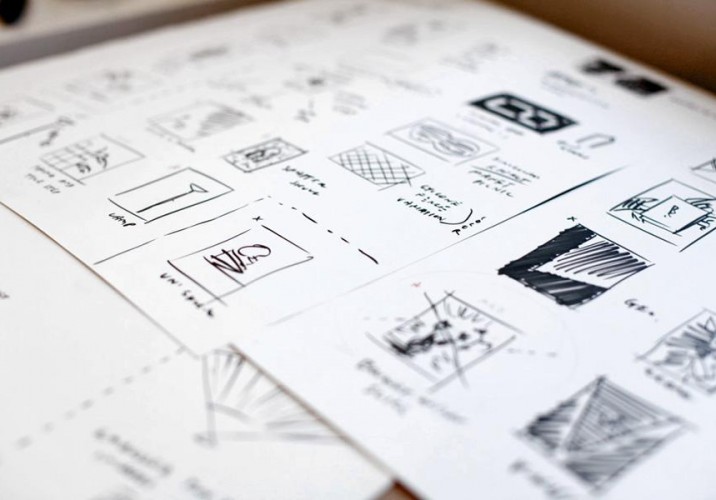
“This is me planning my show for the Hole,” says Gruzis of these pages of sketches sitting on his desk. You can spot the binoculars piece among them, plus a version of the digital 8 and references to a “modernist sculpture of glasses,” he says. “I’m also going to do another projection piece hopefully. I’m working on a generative video that’s a standalone sculpture. It will have three layers — rain, shadow dancers, and a digital clock — that are all independent and randomized but also interact with each other. You know those projection clocks you get at Radio Shack? I’m going to do the minimalist, John McCracken–style floor sculpture version of that, a gloss black thing with a swiveling rectangle that projects this onto the wall.”
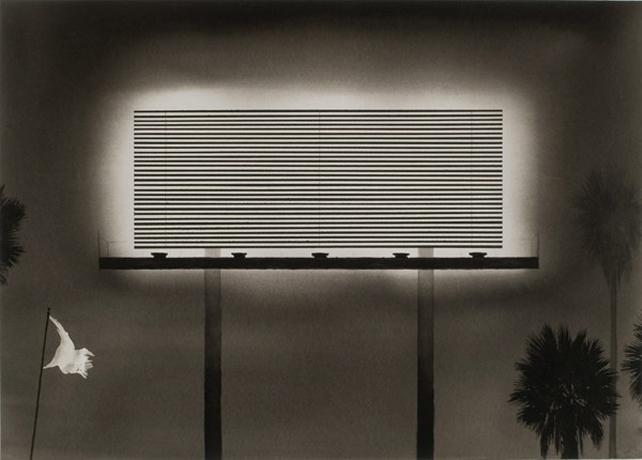
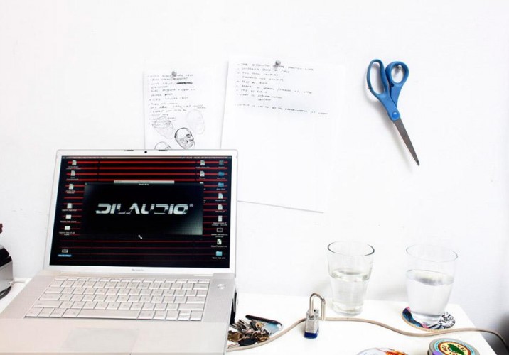
“This is a design for a large lightbox that will also be part of the show, which sort of follows from my the ’80s graphic design stuff,” Gruzis says. “It’s supposed to be this made-up high-end audio equipment brand, but mixed with Dilaudid, which is a pharmeceutical-grade narcotic.” He’ll print the piece on a duratrans, lit from behind, making it look like an ad in a stereo store. The Hole show itself doesn’t have a specific overarching theme, nor do most of his exhibitions: “Everything fits into one idea all the time,” he says.
A test-run for another series he’s working on, of text compressions. He’ll choose a word or a phrase — “free love,” “champagne” — and pile the letters on top of each other in a way that creates an interesting composition, then paint them in ink. One subset of the series will feature a compression for every color of the rainbow, but painted in black and white. “So it’s everything that isn’t color, but it’s about color,” he says.
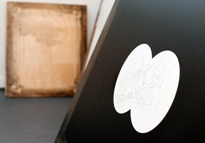
“These are works in progress, leaned against the wall in a big stack,” Gruzis says. “You’re seeing the works before I’ve added the background washes, so they look rather naked.”
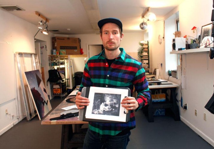
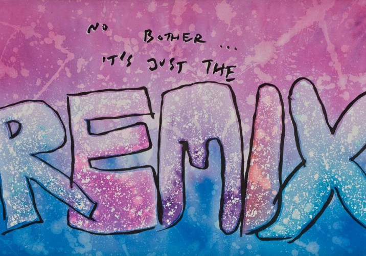
Also likely to be included in the show are the aforementioned acid notes, which Gruzis wrote a few years ago when he was on acid and has taken to reproducing in his signature style (above). But Gruzis has other irons in the fire — he’s working with a friend to launch a company which will produce artist editions (clothing, sculptures, prints) that will hew closely to the feel and format of what the artist already creates. “So for instance, my black and white ink pieces, people are like, have you ever thought of mezzotinting?” he explains. “I’ve been hearing that for four years. So I’m like, I should make a fucking mezzotint, you know? It’s going to have the same aesthetic, and that lush contrast between black and white, but in a medium where we can make edition prints. We’re treating the multpile as an aesthetic itself, not just an economic extension.” Called Signed and Numbered, the project should launch this summer.
When he was an art student in the '80s — in Kassel first, and then Berlin — Markus Linnenbrink worked primarily with grays and blacks. “I had no idea what to do with color,” he admits. “And honestly, I was a little afraid of it.” Which is ironic, considering that for more than a decade, the German-born, Brooklyn-based artist has built a body of work that centers around thick streaks of color — painted in stripes on gallery walls, poured in puddles on the floors of art-fair booths and installations, and dripped in lines down the face of his canvases. “Somehow a field trip to Italy where we spent three weeks painting outside got me into the idea of color, but I had a long period where I would mix, like, red and green. I feel like I had to walk through a lot of dirt and mud to get to the brightness.”
The first time I met Brooklyn artist Jason Rosenberg, I brought him a present. It was nothing fancy. Earlier that day, I’d gone to the doctor and left with a prescription tucked inside a tiny plastic pharmaceutical bag, printed with a picture of a pill and the name of a generic medication. Lest my gift-giving skills be called into question, I should explain that I was headed that night to Kiosk, the New York shop where Rosenberg was hosting a Plastic Bag Happening: The idea was to bring a bag and either exchange it for one of the many Rosenberg has collected over the years, or to have the artist, equipped with his vintage White sewing machine, transform the bag into something totally different — a hat, a pencil case, a coin purse, a wallet. I walked away with two slim sacks from Systembolaget, Sweden’s chain of state-sponsored liquor shops; Rosenberg, when I visited him in his Greenpoint studio last month, was still holding on to the bag I’d brought, though where to find it in his heaps of pseudo-organized boxes, bins, and file folders was another story.
It’s a wonder that Jim Drain isn’t a hoarder of epic, A&E-worthy proportions. Sure, nearly every corner of the 3,000-square-foot Miami studio he shares with fellow artist and girlfriend Naomi Fisher is crammed full of stuff — chains, knitted fabric scraps, yarns, paint cans, talismen, toilet tops, costumes, books, prints, past works, and parts of past works that have been dismembered, all jockeying for attention. But considering Drain has worked with 10 times that many mediums in his nearly 15 years of making art, fashion, and furniture — often incorporating junk found in thrift stores and back alleys — hey, it could be a lot worse. “My dad will find something and go, I got this weird thing I think you’ll like, and my friends do it too, and I’m like, I’m not a trash collector!” he insists.