If you were to chart the degrees of separation among young American designers, you might do well to start with Alex Lin. Since 2007, Lin — a Yale School of Art grad and former designer at 2×4 — has created all of the branding and collateral for Brooklyn-based furniture designer Stephen Burks, who often does work for the sustainably minded home accessories company Artecnica, who recently launched a line of pendant lights by Rich Brilliant Willing, who produce their Excel light series with Roll & Hill, who shared an exhibition space at this spring’s Noho Design District event with Areaware, who commissioned a special 5-year anniversary piñata from Confetti System, who did the set design for United Bamboo’s Spring/Summer ’09 campaign. Confetti System also happen to share an 11th-floor Manhattan studio with Lin, who is the mild-mannered, super-talented graphic designer at the vortex of this Venn diagram–gone-haywire.
Lin has headed up his own shop for only two years, but in that time, he’s worked with every creative on this list and then some. (Did we forget to mention the American Design Club, The Future Perfect, and recent Sight Unseen subjects Iacoli & McAllister?) It’s a testament to Lin’s vast creative gifts that he’s been able to work almost exclusively by referral among a tight-knit group. But it’s an even greater testament to his creativity that the work he’s done for each of these clients doesn’t begin to reveal a singular style. “I like to work with designers because they have strong points of view, which pushes me to do things I wouldn’t normally do,” says Lin. “I think the goal is always to see the design I did, and then to be like, ‘Oh, did I do that?’”
With most projects, Lin, like a journalist, zeroes in on the most idiosyncratic thing about a client and builds a narrative around it. When he first began working for Burks, for example, an impromptu visit to the designer’s studio ended up informing the navigation for Burks’ Readymade Projects website. “He had this packed inspiration shelf. He put everything there — products, inspiration, his son’s inflatable toy — all in reverse chronological order, with the new stuff first. It sort of put everything in context,” he says. It also eventually became the way that visitors root around for projects on Burks’s site. The result of these sorts of symbiotic relationships is work that creates a new visual language for each client but also seems a logical and organic outgrowth of each specific practice.
It also means that clients have begun to entrust Lin with more than just printed ephemera or web design. After working for years with Artecnica, Lin was recently asked by the company’s creative director and founder Tahmineh Javanbahkt to be involved in its Design With Conscience program, which pairs designers with craftspeople and artisans. Javanbahkt introduced Lin to a Los Angeles–based organization called Homeboy Industries, which helps rehabilitate ex-gang members through jobs like silk-screening and embroidery. “The founder of Homeboy Industries is this Jesuit priest who gives speeches all over the country and comes up with these great quotes that really speak to what the organization does — ‘Nothing stops a bullet like a job’ or ‘If you hang out around the barbershop, you’ll wind up with a haircut,’” Lin says. “We came up with a series of tote bags. Initially I thought I’d do the lettering for the quotes using a sign painter, but then we found some Homeboys who were really great at drawing and tattoos. So I sent them a PDF of some initial designs and had them basically interpret the lettering how they wanted. It was great because I had to figure out how each design decision could directly support the idea of helping Homebody Industries, to both raise awareness and to actually give them more jobs.”
Those bags will be released at the end of this month, and in the meantime Lin is creating more work for the American Design Club, a new e-commerce portal for Areaware, an exhibition catalog for Burks, and more. We recently took time out to get to know the prolific designer who’s on everyone’s speed dial.
Event that inspired you to be a designer: “In college at University of the Arts in Philly, I thought that I might be an illustrator or industrial designer. But then I took graphic design as a freshman. I clearly remember making a John Coltrane CD cover and loving the process of combining found imagery, typography, and color to create something new.”
Style movement you most identify with: “Modernism — mainly because it seems like every design move the modernists made was backed by some kind of logical reasoning. I feel the need to give a reason to all of my design decisions.”
Favorite design ritual: “Drinking coffee. The best is this place called Grumpy Coffee in Park Slope. It’s a morning ritual.”
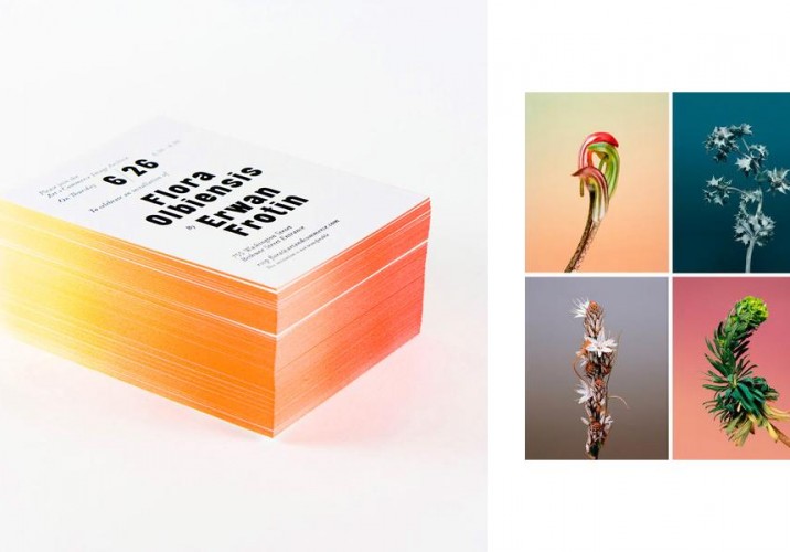
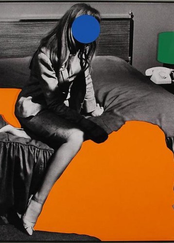
What inspires your work? “Each project really comes from the client. One of things I learned at 2×4 is to try and find, through research and talking to the client, that one special thing you can build a project around. With Lisa Naftolin, I designed these invitations for an Erwan Frotin exhibition at Art+Commerce on his Wildflower series (right). I wanted to get the feel of those gradient backgrounds across without giving it all away, so I came up with the idea of doing a gradient edge. I asked a bunch of different printers; I even thought about asking an autobody shop if they could do it, but it was going to be like $10,000. So we went to a hobby shop and bought an airbrush kit. Clamped them in stacks of 50 and did it ourselves.”
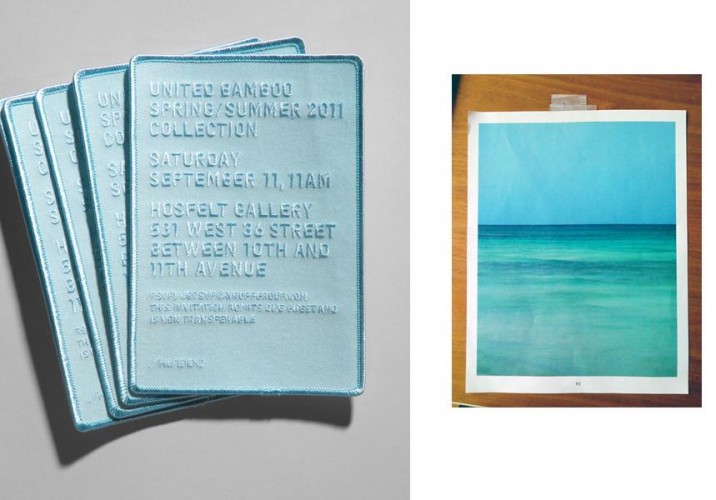
“These embroidered Spring/Summer 2011 show invitations for United Bamboo were inspired by a photo creative director Thuy Pham showed me for the collection.”
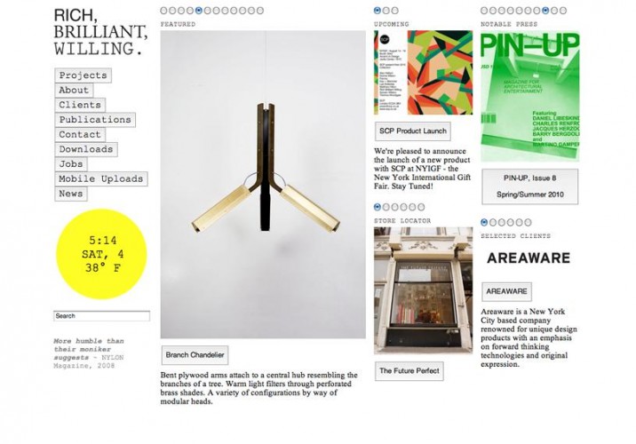
“And Rich Brilliant Willing’s website was built using standard, super-basic HTML components — radio buttons, Courier font — which was inspired by the the group’s penchant for using off-the-shelf parts to create their products.”
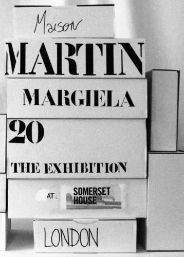
Design hero: “Martin Margiela. He’s got it all figured out — that all-white aesthetic paired with an almost Dadaist sense of absurdity. He’s like a modern-day Duchamp.”
Art hero: Lin cites his brother, the author Tao Lin. “I admire him putting himself out there in such a personal and honest way. This piece by him is titled: financially desperate tree doing a ‘quadruple kickflip’ off a cliff into a 5000+ foot gorge to retain its nike, fritos, and redbull sponsorships. Because he’s my little brother, I can see where his references come from. For example, he seems especially fascinated with hamsters, and we had many pet hamsters growing up.”
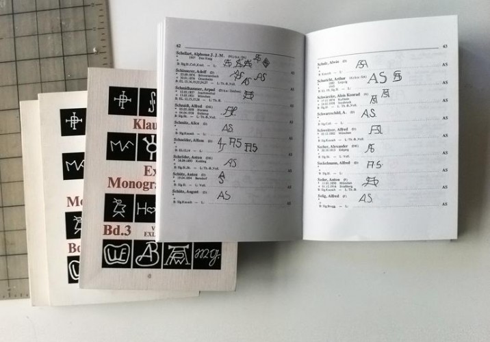
What do you collect?: “I mainly collect books. Having a lot of nice books is like a security blanket for me; it’s similar to the feeling you get when you see your bank account filled with money. I recently found this set of German books filled with monograms at the Chelsea flea market.”
Music most played while you work: “This really depends on how I’m feeling as well as whether I’ve recently discovered any new bands. It’s constantly changing, but lately, a lot of Bear in Heaven.”
What inspires your color palette? “I like pure, vivid colors. I like the way Baldessari, for example, juxtaposes brightness with monotone. Sharing a studio with Confettisystem is pretty inspirational as well!”
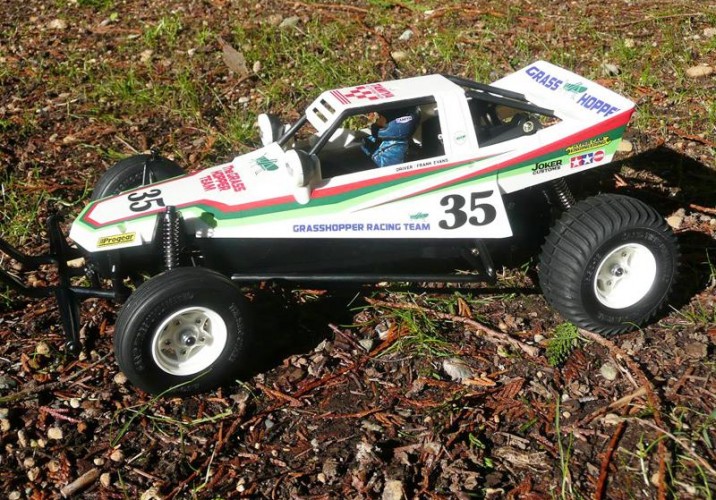
First thing you ever made “I’ve always been proud of being able to put together this RC car called The Grasshopper. I think on the box is says for ages 12 and up, and I did it when I was 8.”
Favorite material to work with: “Although I design a lot of websites, my favorite is print. So, paper, ink, foil stamp, glue, etc.”
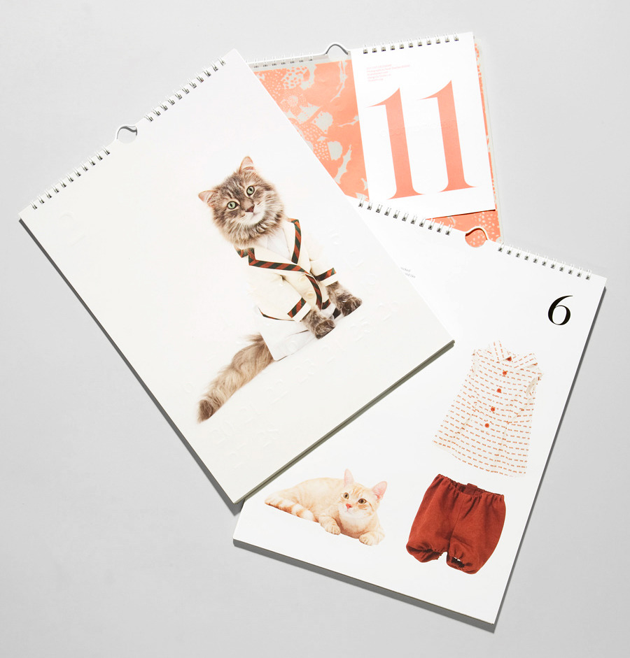
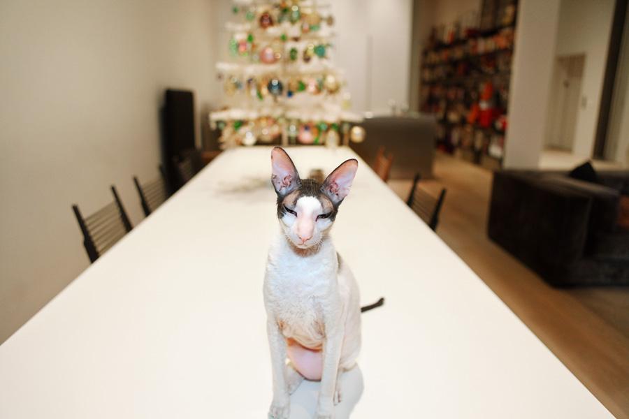
This winter, Lin designed United Bamboo’s second annual cat calendar — a cult favorite in the fashion world, shot by photographer Noah Sheldon — giving him the chance to work with a slew of paper-only techniques: blind-debossed months, a foil-stamped back, a silk-screened sleeve. “I envisioned it as more than just 12 photos of cats. On the back of each page, there’s information about the cat — their age, how their owners got them — and clothes silhouetted like a clothing catalog. It adds a bit more of a narrative.”
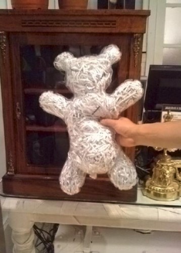
Piece you wish you’d made: “This bear by Comme des Garçons that I saw in Japan. It’s like a clear, really cheap plastic bag — the kind they put newspapers in — inflated, with shredded newspaper inside. It’s so brilliant and fits perfectly into their aesthetic.”
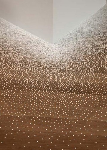
Last great exhibition you saw: “The Nendo exhibition last year at the Museum of Arts & Design. They used these little tiny white dot stickers everywhere to make it seem like the plinths were melting into the floor. It was sublime!”
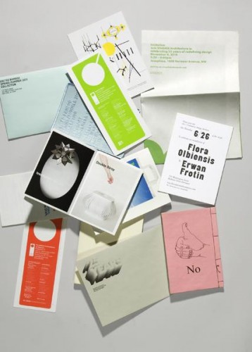
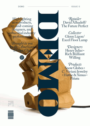
Place you go to be inspired: My bathtub. It’s where I can relax. It’s so comforting, and I feel that I can come up with the best ideas in that situation. I like to read 032c, Purple, and The World of Interiors. I actually came up with the idea of naming the American Design Club’s first publication “DEMO” (above) while in the tub.
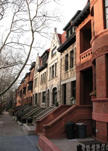
Thing you love most about Brooklyn: “My neighborhood is filled with incredible townhouses from the late 1800s to early 1900s. I’m a huge admirer of molding and architectural details. At night, you can see into the houses, see people’s choice of lighting, whether the house still retains its architectural details — it’s all really fascinating to me.”
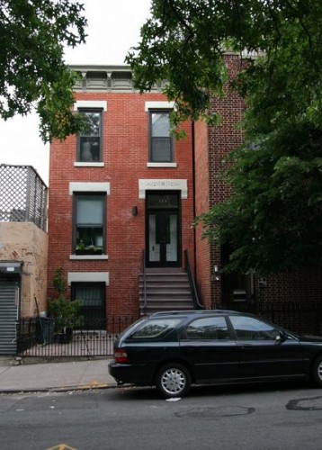
“My wife and I actually recently renovated our house in South Park Slope. During the first two months, I literally had to become a contractor; it’s been about three years now, and I see our house as a side project where I can pretend to be an interior designer.”
Favorite design object: “My Noguchi floor lamps. I found the first one on Craigslist and the second one about a year later on Craigslist. I didn’t realize it was the same seller until I met up with him to pick it up! They pretty much go with anything and cast the nicest soft light.”
Last thing you bought at a flea market: “I bought this wooden gate in Chelsea. We use it at home to keep our French bulldog from going up the stairs. It has the perfect patina and looks like it came with our house. It’s hard to find something so old, yet still functional.”
The 28-year-old graphic designer Kostya Sasquatch makes thick, vector-like graphics on a PC, all cartoon colors and geometric shapes, odd logotypes that create iconographies for systems that seem to exist only in the designer’s mind. (He has a whole series called Donut Control.) They’re the kind of designs that could be from anywhere, but they might not have looked anything like they do if Sasquatch wasn’t from Moscow.
Someone like JP Williams has enjoyed plenty of validating moments in his 20-year career as a graphic designer: Getting to study under one of his design heros, Paul Rand, at Yale; winning more than 100 awards for projects like his kraft-paper tea packages for Takashimaya; discovering that his collection of baseball cards from 1909 was worth enough to buy his wife and business partner Allison an engagement ring. All well and good, however none of it really compared, he admits, to the feeling of being validated by Martha Stewart.
When Mason McFee and Jessica Clark decided to name their new company Crummy House, referring to their own charmingly ancient one-bedroom rental in Austin, Texas, it was mostly out of admiration rather than denigration. Sure, the paint is cracked in places, the garage has an uneven dirt floor, and in the winter, the cold night air blows through with no regard for shuttered windows. And it was a bit of an inconvenience when, two months after they moved in, an old tree fell directly onto McFee’s car. But with two desks in the living room, a workshop in the garage, and the kitchen basically converted into a studio, the house has become a kind of creative haven for the couple — a getaway from McFee’s responsibilities as an art director at the ad agency Screamer, and Clark’s as a graphic design student at Austin’s Art Institute. They spend weekends making art there, side by side, and with Crummy House they’ll start their first true collaboration.